DPI / PROJECT 2
01.9.2021 - 22.9.2021 (Week 6 - Week 9)
LECTURES


Then, we can make a color variation by adding hue, shadow, tint, and tone.


 fig. 13, color harmony, source; (https://gist.github.com/makella/b6a88efd56b7e61446a74e9c9441211b), Week 7 (4/10/2021)


Timeframe: WEEK 3 - WEEK 7
DIGITAL IMAGING EXERCISE 1 (5%)
- Photo Manipulation
Submission: WEEK 6
DIGITAL IMAGING EXERCISE 2 (5%)
- Recoloring Black & White
Submission: WEEK 7
______________________________________________________________
PROJECT 2B: POSTER DESIGN (30%)
Timeframe: WEEK 6 - WEEK 9
Design for social good: Design for the Community project
Theme: MENTAL HEALTH - Stay positive during this pandemic
RESEARCH PRESENTATION: 10 marks (WEEK 6)
IDEA DEVELOPMENT: 5 marks
DESIGN DIRECTION: 5 marks
EXECUTION & POST PRODUCTION: 10 marks (WEEK 9)


As the result I found out that some areas can't be removed from selection even though I used Substract From Selection, so I let it be. After I moved my selection, I found out that there are some parts haven't been cut neatly:


So, I decided to adjust it with eraser and pen tool, and here's how it looks:

I adjusted the color of the layer. By the way, I put myself not as high as the person in references, because I think my height is around 1,5 m and it should be approximately like this:


I also add gaussian blur to my image. I don't add as many as the Shazam, because I thought my picture is in the front which should be having clearer reflection.

So, I did some adjustment to some area to make it neater, and this is my final result:


I combine them using overlay, because I think it gave a stronger color.


Layers & Effect:


1. Posters designed with IMAGES/PHOTOS and texts


 fig. 56, PSA Poster 3, source; (https://pin.it/SJAn3V5), Week 6 (27/09/2021)


I hide all my elements and started to adjust the center. I started to enlarge the photo and applying black and white filter to the element. I also added a bit of blurry effect. I used motion blur.
I add the happy faces to the meeting borders. I reduced the opacity to make a measure.

I adjusted her shirt color a bit darker and make it looks more shadowy.


FEEDBACKS
REFLECTION
Abigail Kartika Darmowinoto / 0350525 / Bachelor of Design in Creative Media
Digital Photography and Imaging / Taylor's University
Project 2 / Poster Design
Digital Photography and Imaging / Taylor's University
Project 2 / Poster Design
RELATED POSTS:
- Week 5 Progression
- Week 6 Progression
- Week 7 Progression
- Week 8 Progression
- Week 9 Progression
- Project 2 - Poster Design
OTHER POSTS:
LIST
LECTURES
<back to top>
Mr. Martin began the lecture by introducing us to the concept of poster design. So, what's a poster? Poster is a medium to convey something to the target audience. Posters can generate awareness on an issue / as a lure for audience to buy a product. Posters can be; cluttered or straightforward. Excessive amount of elements can be confusing for the viewers.
WEEK 5 (20/09/2021) : (POSTER DESIGN)
- Introduction about poster
- PSA (Public Service Announcement)
- How to make a poster?
Then, Mr. Martin taught us some steps how to make a poster which is good and deliver a meaning.
1. RESEARCH
- Study and gather all related information about your topic.
- Write a summary about your topic
- Highlight the key points of your summary
- Define the Title
- Define the Slogan
- Define the Details
- Define the Call For Action
2. DEFINE CONCEPT
- Create a section for each contents (Title, Slogan, Details & Call for Action)
- Sketch your mock up poster
- Fill in with details
3. DEVELOP DESIGN PROJECT
- Draft the digital poster based on your sketch
- Develop the composition techniques using Digital Photography & Graphic Design.
- Apply color, typography, textures & effects
- Finalize your design with color correction
- Elements
Creative posters usually consist of some elements; title, graphic, text, whitespace.

fig. 1, Poster Elements, source; (https://www.behance.net/gallery/80218051/Climate-Change-PSA-Poster/modules/465154763), Week 5 (20/09/2021)
1. TITLE
- A descriptive indicator of poster's content
- Shouldn't exceed two line of text
2. GRAPHIC TEXT
- Shouldn't be overload
- Deliver the message clearly
3. GRAPHIC
- The star of the poster
- Mostly describe what the author want to tell
- Better a high resolution image (300 dpi or more)
4. WHITESPACE
- Creates a "breathing room"
- Avoid viewers to feel overwhelmed by the information presented
But, out of that four, there are some elements that affect the beauty and effectiveness of a poster, they are; layout, flow, and color.
WEEK 6 (01/10/2021) : (PSA POSTER)
In this week's lecture, Mr. Martin gave us a lecture which the material is continued from last week lecture. For short, there are three main steps on making poster; research, define concept, develop design project. Mr. Martin added some information about steps in steps 2 of making poster (defining concept).So, in the second part of making poster the authors are challenged in the way they evoked the readers. There are five ways to evoke readers' feeling and reaction:
- Shock Value →Brutal

fig. 2, Shock Value, source: lecture, Week 6 (27/09/2021)
- Provocative →Upsetting

fig. 3, Provocative, source: lecture, Week 6 (27/09/2021)
- Humor →Sarcastic

fig. 4, Humor, source: lecture, Week 6 (27/09/2021)
- Sensitive →Heart warming

fig. 5, Sensitive, source: lecture, Week 6 (27/09/2021)
- Artistic →Subtle

fig. 6, Artistic, source: lecture, Week 6 (27/09/2021)
But for Mental Health PSA, they usually take a gentle approach; graphics work well, target audiences vulnerable. Examples:

fig. 7, Mental Health PSA Posters, Week 6 (27/09/2021)
WEEK 7 (08/10/2021) : (COLOR THEORY)
COLOR HARMONY
Mr. Martin started the lecture by explained us about the three main color; red, yellow, blue. fig. 8, Color Wheel, source; lecture, Week 7 (4/10/2021)
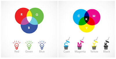
Then, he explained there're two systems of color, RGB and CMYK. What're they?
- RGB (Red, Green, Blue) : used in display
- CMYK (Cyan, Magenta, Yellow Black) : used for printing

fig. 9, RGB CMYK, source; lecture, Week 7 (4/10/2021)
In my observation, RGB use white as combination, CMYK use black as combination.

fig. 10, hue shade tone tint, source; lecture, Week 7 (4/10/2021)

fig. 11, hue shade tone tint II, source; (https://twitter.com/thefuturishere/status/1016890351586459648?lang=ga), Week 7 (4/10/2021)
Then, Mr. Martin talked about color harmony. There're lots of variation of color harmony:

fig. 12, color harmony, source; lecture, Week 7 (4/10/2021)

- Monochromatic :
- One color but different shade and tint.

fig. 14, monochromatic, source; lecture, Week 7 (4/10/2021)
- Analogous :
- Three color located side by side.

fig. 15, analogous, source; lecture, Week 7 (4/10/2021)
- Complementary :
- 1 main color and its opposing color
- Most popular color combination since make a good contrast
- High contrast

fig. 16, complementary, source; lecture, Week 7 (4/10/2021)
- Split Complementary :
- 1 main color, then choose split left and right

fig. 17, split complementary, source; lecture, Week 7 (4/10/2021)
- Triadic :
- Evenly spaced color

fig. 18, triadic, source; lecture, Week 7 (4/10/2021)
COLOR PSYCHOLOGY
After Mr. Martin lectured us about type of color, he began to explain about color psychology. Culture also influenced color psychology. For example, in western color, this is the color psychology;
fig. 19, color psychology, source; lecture, Week 7 (4/10/2021)

fig. 20, color psychology II, source; (https://graf1x.com/color-psychology-emotion-meaning-poster/), Week 7 (4/10/2021)
Then, Mr. Martin divided it into 2 types; warm and cool. Warm color usually evokes warm feelings like happiness, optimism, and energy. Cool color usually evokes feelings like calm, soothe, or even sadness. However, some color also have different meanings to note.
- Red / orange / yellow > can be > attention / signal of danger
- Blue > can be > sadness
- Purple (mixture of blue) > can be > calm
- Purple (mixture of red) > can be > intense
- Black > can be > elegance, mystery
- White > can be > clean, virtuous, healthy
WEEK 8 (15/10/2021) :
Individual Learning Week!WEEK 9 (22/10/2021) :
Lecture will be posted on next project.INSTRUCTIONS
<back to top>
<iframe src="https://drive.google.com/file/d/1pHwjSk8-Bzmv7iN9-yygmDtXXoOqL4yv/preview" width="640" height="480" allow="autoplay"></iframe>
WEEK 5 : RESEARCH
- Research on "mental heath affected by COVID19":
- How are you, as an individual affected by COVID19? Physically and mentally? Are they related?
- Research online:"young adult/student's mental heath affected by COVID19", save/bookmark the articles that you are interested. Make a summary of each articles.
- View posters on Pinterest, limited to posters designed with IMAGES/PHOTOS and texts, bypass posters designed with GRAPHIC and texts. PIN the posters that you like, ask yourself what do you like about the selected posters? The composition? The colour? The way the message been delivered?
- View posters on Pinterest, limited to PSA posters only. PIN the posters that you like, ask yourself what do you like about the selected posters? The composition? The colour? The way the message been delivered?
- Post your finding on Blog under Project 2.
- Summary: Do research of the poster's topic (ourselves and article) + look and pin some poster inspirations (Graphic and Text, and PSA posters) that we like and reason why we like it.
Timeframe: WEEK 3 - WEEK 7
DIGITAL IMAGING EXERCISE 1 (5%)
- Photo Manipulation
Submission: WEEK 6
DIGITAL IMAGING EXERCISE 2 (5%)
- Recoloring Black & White
Submission: WEEK 7
______________________________________________________________
PROJECT 2B: POSTER DESIGN (30%)
Timeframe: WEEK 6 - WEEK 9
Design for social good: Design for the Community project
Theme: MENTAL HEALTH - Stay positive during this pandemic
RESEARCH PRESENTATION: 10 marks (WEEK 6)
IDEA DEVELOPMENT: 5 marks
DESIGN DIRECTION: 5 marks
EXECUTION & POST PRODUCTION: 10 marks (WEEK 9)
PROJECT 2A : SHAZAM & INDIVIDUAL PHOTO
1. Shazam
Shazam's editing exercise can be found here.
2. My Reflection
So Mr. Martin provided us a picture (Hearst Castle), which we have to cut our photo and edited it there.

fig. 21, Hearst Castle, Week 5 (20/09/2021)
Then, Mr. Martin gave two pictures to be used as reference about Hearst Castle. I used the reference to determine my actual approximate height.

fig. 22, Reference 1, Week 5 (20/09/2021)

fig. 23, Reference 2, Week 5 (20/09/2021)
First, I used Quick Selection Tool to cut my image:

fig. 24, Using Quick Selection Tool Preview, Week 5 (20/09/2021)

fig. 25, Unclean Cut 1, Week 5 (20/09/2021)

fig. 26, Unclean Cut 2, Week 5 (20/09/2021)

fig. 27, Cleaned Cut, Week 5 (20/09/2021)

fig. 28, Adjustment 1, Week 5 (20/09/2021)

fig. 29, Adjustment 2, Week 5 (20/09/2021)
After I'm satisfied, I started to make the reflection. I started to adjust the brightness and contrast to fit the environment.

fig. 30, Reflection, Week 5 (20/09/2021)

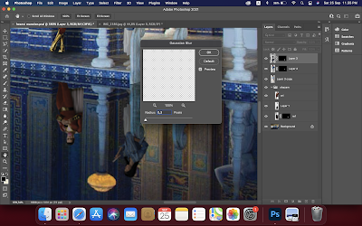
fig. 31, Gaussian Blur, Week 5 (20/09/2021)
I just realized I haven't add any shadows to myself, so I add it using black colored brush. After that I use a Gaussian Blur effect to make it look more natural. I use 4,0 gaussian blur;

fig. 32, Shadow, Week 5 (20/09/2021)

fig. 33, Result, Week 5 (20/09/2021)
fig. 34, Result in PDF, Week 5 (20/09/2021)
3. Photo Recoloring
Photo recoloring exercise can be found here.
4. Photo Recoloring (advanced 1)
Photo Recoloring (advanced 1) can be found here.
5. Photo Recoloring (advanced 2)
We were given some choices of black and white colored portrait by Mr. Martin. We were assigned to recolor a photo of our choice. The photo that I chose is this:

fig. 35, bnw photo, source; (https://drive.google.com/drive/folders/1czJ0D44XGRTp8gVCHxqcuArBfLZqWK5-), Week 7 (4/10/2021)
Then, we have to search for skin tone and hair color reference. So, I found my references on Pinterest.
fig. 36, skin reference, source; (https://pin.it/2cx5JT9), Week 7 (4/10/2021)

fig. 37, hair reference, source; (https://pin.it/15Bqz8i), Week 7 (4/10/2021)
For the first step I did, I pick some skin and hair color using eyedropper tools.

fig. 38, color finding, Week 7 (4/10/2021)
Then, I started to make a selection and mask it. After that I adjust the masking. I started with hair.

fig. 39, hair masking, Week 7 (4/10/2021)
This is the color I got from the reference.

fig. 40, hair coloring, Week 7 (4/10/2021)

fig. 41, overlay, Week 7 (4/10/2021)
Then, I continue my progression into making the skin color. I used the same method as before.
fig. 42, skin selection, Week 7 (4/10/2021)
For the lip and iris, I decided to do it manually without masking, since I think it's easier and faster, so here's my work preview;
fig. 43, lip and eye, Week 7 (4/10/2021)
Then, I started to do the background, it's very hard since the hair is everywhere. So, after I cleaned my masking for a long time, I managed to get a cleaner masking. (not perfect thought!) Here's my masking preview after I add a soft yellow color.

fig. 44, background masking, Week 7 (4/10/2021)
Finally, here's my final progression:

fig. 45, final, Week 7 (4/10/2021)
fig. 46, final in PDF, Week 7 (4/10/2021)

fig. 47, layer preview, Week 7 (4/10/2021)
- eye : soft light (no masking)
- lip : soft light (no masking)
- face : soft light (masking)
- hair : overlay (masking)
- layer 4 (background) : color (masking)
PROJECT 2B : DIGITAL POSTER
RESEARCH
RESEARCH.01 (COVID-19 and Its Effects on Young People Mental Health)
How It Affects Myself (1)
"As an individual who's an introverted person and rarely hangout with friends, I don't feel very overwhelmed by staying at home for a long time, It's just a piece of cake," said myself in the early months of the outbreak in my country. But since the outbreak happened for almost 6 months, I started to feel something different about myself. I'm pulling back my words.
Things were getting out of control as the number of cases roses. I read lots of chaos in the news. As time went by, the number of cases always rise up, and it's so tiring to hear a negative news. I saw numerous of news telling about people terminated from their job, numerous people infected, even lots of dying people. I heard some of my parents' friends were dead caused by COVID-19. I started to feel stressed, threaten, anxious, and paranoid. Besides that, what I feel the most is numbness. I felt empty inside. I miss my friends, and my school memory. I saw some of my friends who have to resigned from school, or can't continue their study because their economy were affected by COVID-19.
Other than that, since online learning conducted, things were felt different and unreal. At first, I feel like I'm happy of not having to wake up early in the morning to prepare for school, can study 24/7 from home, but as time went on, I started to feel uneasy because I'm forced to be in my room for a long time studying more modules because it's online class, alone. I was a part of a school organization, I became a leader of an event and have to change the way it is and it felt so frustrating. This conclude that as a student we also have to be adaptive to unusual things.
To be honest, it doesn't really impact on me directly, compared to other people, but still, it really has a big impact to my mental health. I began to think, if it's impacting me, how about the the other young adults? How do they feel?
How It Affects Young Person / Student Like Me (2)
1. UNICEF's Research (source; here)
UNICEF conducted a research of 8,444 adolescents and young people between the ages of 13 and 29 in nine countries and territories in the region. The research from UNICEF said that 1 of 2 people feel less motivated to do activities they usually enjoy, due to the situation of their localities, young woman report a higher percentage of anxiety (27% anxiety, 15% depression), 43% of young women feel pessimistic of future compared to 31% of men.

fig. 48, Less Motivated, source; (https://www.unicef.org/lac/en/impact-covid-19-mental-health-adolescents-and-youth), Week 6 (27/09/2021)

fig. 49, Anxiety, Depression, source; (https://www.unicef.org/lac/en/impact-covid-19-mental-health-adolescents-and-youth), Week 6 (27/09/2021)

fig. 50, Pessimistic, source; (https://www.unicef.org/lac/en/impact-covid-19-mental-health-adolescents-and-youth), Week 6 (27/09/2021)
WEB REFERENCE:
UNICEF. 2020. "The impact of COVID-19 on the mental health of adolescents and youth", accessed on September 27, 2021 (00.03, UTC+7), https://www.unicef.org/lac/en/impact-covid-19-mental-health-adolescents-and-youth 2. Department of Education USA (source; here)
Based on a survey from Active Mind, from nearly 2.100 college students, 80% of them said that COVID-19 impacted their mental health negatively, mostly giving higher effect in feeling stress and anxiety, disappointment, sadness, loneliness, and isolation.

fig. 51, Active Mind Research, source; (https://www2.ed.gov/about/offices/list/ocr/docs/20210608-impacts-of-covid19.pdf), Week 6 (27/09/2021)
E-JOURNAL REFERENCE:
Department of Education United States of America. 2021. "Education in a Pandemic: The Disparate Impacts of COVID-19 on America’s Students", COVID 19 Impact on College Student Mental Health, [online], page 43, accessed on September, 27 2021 (00.24 AM, UTC+7), https://www2.ed.gov/about/offices/list/ocr/docs/20210608-impacts-of-covid19.pdf.
RESEARCH.02 (Poster Designs Inspiration)
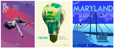
1. Posters designed with IMAGES/PHOTOS and texts

fig. 52, poster example 1, source; (https://pin.it/1moPMl3 , https://pin.it/10XfQhB), Week 6 (27/09/2021)
This poster is about Noel Gallagher and part of his song lyric, "Flying Birds". The second one is not really a poster, it's more like a photography but what I want to show is the way the designer use the text and picture combinations. Things that make me interested in this composition, is firstly it's balanced symmetrically. Although the right and left part of the poster are different elements, but the words are still following and shaping the face shape. I also like how the designer used like an overlay effect for the text so it still showing the man's face.

fig. 53, poster example 2, source; (https://pin.it/6danMr0), Week 6 (27/09/2021)
The second poster is about a promotion of fashion bazaar. What I like from this poster are the eyecatching and great capture using perspective. I thought it's an illustration at a glance, but as I look more in it, I notice that it's a photography combined with graphic design. I like how the designer place the text as if it's a frame, it makes the main focus is the woman, especially her heels. It's really describing about fashion.
2. PSA posters

fig. 54, PSA Poster 1, source; (https://pin.it/7zdyHSs), Week 6 (27/09/2021)
It's a PSA posters about mental health. The designer use a provocative method. The objective is to tell readers about mental health and a hotline of a service. I like how the designer make eye-catching design. I like how the designer tells the reader the feeling of those who have mental health problem. The designer use a paper ripped then write harsh word "nutter" which that make people want to know what poster is it. Then, the designer tells the objective of the poster using a descriptive text below.

fig. 55, PSA Poster 2, source; (https://pin.it/35I9ZPn), Week 6 (27/09/2021)
The second poster that I found is about a modern slavery, especially children slavery. The designer use a provocative method to tell the objective. What I like from this poster is how the designers communicate to readers. The poster clearly tells the reader about child slavery by putting a girl into a box and tied it with some kind of boarding pass. I also like how the designer put the text, combined with the object.

The last one is my most favorite poster. It's describing about Red Cross (ICRC) service. The communication method is using provocative. It's a very powerful poster design which tells and provoke the reader to help people using first aid method. I like how the designer make a very clear design by using only little space for texts. For me, I think the design is out of the box. It's simple yet a mesmerizing design.
CONCEPT DEFINING
After searching for some researches and inspiration I began to make my poster. The theme is, "MENTAL HEALTH - Stay positive during this pandemic". I'm actually inspired form these images I found on Pinterest:

fig. 57, inspiration, Week 6 (27/09/2021)
I'm planning to show the unhappy side of people caused by pandemic. My main focus are young adults (not children, not adults), mostly teens / adolescences. I'm planning to make a poster with two face expression, one for the face that they show to people in online school, and another one a sad face expression about their feeling.
I made 2 concepts. I used digital elements on both designs to show about the concept "online" better. So, here they're:
fig. 58, sketch 1, Week 7 (4/10/2021)

fig. 59, sketch 2, Week 7 (4/10/2021)
I researched on some fonts idea:
fig. 60-63, fonts, Week 7 (4/10/2021)
DEVELOPING THE DESIGN
I began to search for stock photos in Google. These are some photos that I'm going to use on my poster:
fig. 64, A, Week 7 (4/10/2021)
fig. 65, B, Week 7 (4/10/2021)
fig. 66, C, Week 7 (4/10/2021)
SOURCES:
After that, I began to create my posters, these are the draft for sketch 1 and 2:
fig. 67, Draft 1, Week 8 (11/10/2021)
fig. 68, Draft 2, Week 8 (11/10/2021)
I actually forgot to documented my process, but I'm going to explain how to make the elements.
fig. 69, Draft 1 Steps, Week 8 (11/10/2021)
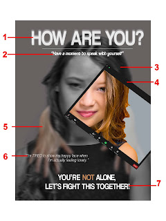
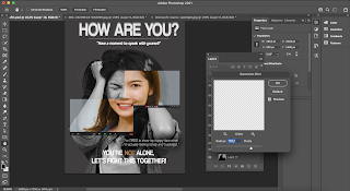
- Title: I use a white colored coolvetica for my title to make a good contrast with the background. I choose sans serif because I remembered my typography lecturer said that sans serif suits digital media better than serif. I copy the format and paste it behind the text and apply Gaussian Blur to make the text looks like it has soft blurry outline.
- Slogan: I use the same font as title and I make them italic because I want the font to have a difference from the title. I add a line to divide the title and slogan.
- Main element: I use the sad expression as the main subject. I used Image > Adjustment > Black and White to make a BnW version of the image. Then I apply Gaussian Blur again to make it blur.
- ZOOM element: I cut the reference image to make ZOOM border, then I add the happy side of her. I don't change the color to BnW to make her as if she's happy, colored.
- HAND: I searched for a hand png on Google, then I cut some lines and uneven curves. After that, I adjust the opacity of the element and apply a gaussian blur on it.
- Details: I want to make it saying her inner feeling of coping with the term "online" and "isolation". I used Helvetica-Light Oblique to make it has a thinner stroke so it don't make the text too much and emphasized on the details.
- Call for Action: I used capitalized coolvetica to make it stands out. I especially emphasized on the word "not" to make it sounds 100% NOT.
fig. 70, Fonts, Week 8 (11/10/2021)
Font source;
Helvetica : Default
At Week 8-9 Mr. Martin gave me a feedback that said I should go with design 1 cause it fits the theme better. Mr. Martin said my expression weren't sad enough, so I searched for more stock photos in Google. I'm a little bit struggling to search the sad one, so I decide to make it look more frustrated.
A
B
C
D
SOURCES:
So, I adjust my #1 design. I started from removing the girl in the poster. Then, I began to cut the new stock photo I got.
fig. 74, frustrated, Week 9 (18/10/2021)
fig. 75, happy, Week 9 (18/10/2021)
I cut and paste the selection and adjust it a bit.
fig. 76, selections, Week 9 (18/10/2021)

fig. 77, bnw, Week 9 (18/10/2021)


fig. 78-79, layering, Week 9 (18/10/2021)

fig. 80, recoloring, Week 9 (18/10/2021)
fig. 81, recoloring 2, Week 9 (18/10/2021)
Using the brush, I make a shadow

fig. 82, shadowing, Week 9 (18/10/2021)
Then, I experienced some text layouting.

fig. 83, horizontal, Week 9 (18/10/2021)

fig. 84, vertical, Week 9 (18/10/2021)
I think the horizontal one is better as it offers easier reading accessibility. I add shadows behind the text to make it easier to read.
fig. 85, poster concept pdf, Week 9 (18/10/2021)
fig. 86, final compilation, Week 9 (18/10/2021)
FEEDBACKS
WEEK 6: n/a
WEEK 7: n/a
WEEK 8: Individual Learning Week!
WEEK 9: Both digital drafts showing good quality of design. However, the 1st one is related better with the theme, 2nd might mistaken for theme related to social media addiction or some sort. The contrast in the 1st poster is good but can be stronger, the B&W doesn't look sad enough.
REFLECTION
I'm happy that I got a chance to learn photo manipulation, and recoloring. It's the coolest subject I ever want. I finally could dye my hair, my clothes and anything! I thought this subject was very hard and neat patience to learn, but turns out it's actually simple when you understand the basics, and it's also a fun thing to do. From the poster assignment, I think I'm not really good in making compositions, so I thought mine was a decent one. But I'm very glad that I got a chance to speak up feelings regarding to mental health during the pandemic.


Comments
Post a Comment