DPI / Week 8 (Digital Poster)
11.10.2021 (Week 8)
Abigail Kartika Darmowinoto / 0350525 / Bachelor of Design in Creative Media
Digital Photography and Imaging / Taylor's University
Week 8
RELATED POSTS:
LECTURES
Independent Learning Week : no class
INSTRUCTIONS
<back to top>
<iframe src="https://drive.google.com/file/d/1pHwjSk8-Bzmv7iN9-yygmDtXXoOqL4yv/preview" width="640" height="480" allow="autoplay"></iframe>
WEEK 8:
Continue progression.
After I collect my asset, I began to create my posters, these are the draft for sketch 1 and 2:

fig. 1, Draft 1, Week 8 (11/10/2021)

fig. 2, Draft 2, Week 8 (11/10/2021)
I actually forgot to documented my process, but I'm going to explain how to make the elements.
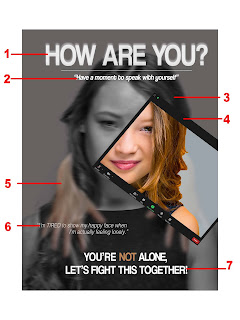
fig. 3, Draft 1 Steps, Week 8 (11/10/2021)
- Title: I use a white colored coolvetica for my title to make a good contrast with the background. I choose sans serif because I remembered my typography lecturer said that sans serif suits digital media better than serif. I copy the format and paste it behind the text and apply Gaussian Blur to make the text looks like it has soft blurry outline.
- Slogan: I use the same font as title and I make them italic because I want the font to have a difference from the title. I add a line to divide the title and slogan.
- Main element: I use the sad expression as the main subject. I used Image > Adjustment > Black and White to make a BnW version of the image. Then I apply Gaussian Blur again to make it blur.
- ZOOM element: I cut the reference image to make ZOOM border, then I add the happy side of her. I don't change the color to BnW to make her as if she's happy, colored.
- HAND: I searched for a hand png on Google, then I cut some lines and uneven curves. After that, I adjust the opacity of the element and apply a gaussian blur on it.
- Details: I want to make it saying her inner feeling of coping with the term "online" and "isolation". I used Helvetica-Light Oblique to make it has a thinner stroke so it don't make the text too much and emphasized on the details.
- Call for Action: I used capitalized coolvetica to make it stands out. I especially emphasized on the word "not" to make it sounds 100% NOT.

fig. 4, Fonts, Week 8 (11/10/2021)
Font source;
Helvetica : Default


Comments
Post a Comment