DPI / FINAL PROJECT
18.10.2021 - 22.11.2021 (Week 9 - Week 14)

Realism: ordinary, based on reality, don't need to think outside the box


First, we were asked to download an image provided for exercise.


AE exercise can be found here.


1. Camera body:
Shutter
Image sensor
LCD screen
2. Camera lens:
Aperture/ Iris

- Shutter speed and aperture : affect the actual “luminous exposure” of an image.


To add sequence, go to bottom left and add new sequence like this:

This is what Mr. Fauzi recommended us to choose.


Them, drag it on your workspace. Use this icon to trim the duration if needed.


This is the preview of using color correction:


The next thing to do is adding it to the workspace and adjust thing as needed. To show up only the grunge, go to effect and reduce to opacity. Then you'll get your result.

Mr. Martin demonstrated an offline lecture of Photo Studio Lightning.


What's a double exposure??
1. Using the Tilt-Shift Effect
 3. Experiment with simple portraits and details textured


EXAMPLE:
TUTORIAL:


Then, I adjusted the jelly fishes using the match color and adjusted the opacity:


To make a neat cut, I select the mark, which I made in a different layer select inverse, then go back to the object layer and erase it. This is how it looked like:


After I'm done with the still image, I moved forward to animating it.
First thing first, I created a copy of my Photoshop file. I did it to ensure I have a backup for my work. Also, I want to merge some layers that don't need to be animated. Here's how it looks:


This is how it looked like:

Thus, I started to finalize my project since it's the week of submission. For my animation, I added this soundtrack. It's a good song from Ghibli that made like a music box song:

Title: Nirvana
Size: 1080 px (width) : 1920 px (height)
FEEDBACKS
REFLECTION
Abigail Kartika Darmowinoto / 0350525 / Bachelor of Design in Creative Media
Digital Photography and Imaging / Taylor's University
Project 3 / Final Project; Cinemagraph - Self Titled
LECTURES
Digital Photography and Imaging / Taylor's University
Project 3 / Final Project; Cinemagraph - Self Titled
LIST
RELATED POSTS:
LECTURES
<back to top>
WEEK 9 (18/10/2021) : SURREALISM
Mr. Martin introduced us to Digital surrealism since our final project will be about digital surrealism.- Reaslism vs Surrealism:

fig. 1, realism vs surrealism, source; lecture, Week 9 (18/10/2021)
Surrealism: twist on realism, explores the subconscious mind. >> dream images, distort the reality.
- Salvador Dalí
fig. 2, Salvador Dali's creation, source; lecture, Week 9 (18/10/2021)
Who's he?
- Spanish surreal painter
- Inspired from: teachings of freud and rebellious work of Dada Artists.
- Promoted: free association and dream imagery.
Dadaism?
- An anti war art movement with art works that is satirical and nonsensical in nature.
- What's surrealism?
fig. 3, surrealism, source; lecture, Week 9 (18/10/2021)
Surrealism: defies logics. Usually out of box, work of subconscious mind, filled with strange images and bizarre juxtapositions.
Express the artists' ideas themself. Surrealism is one of the top digital artstyle.
- How to create surrealism?
- Use dream like scene and symbolic messages
- Unexpected, illogical juxtapositions
- Bizarre assemblages of ordinary objects
- Primitive, child-like
- How to capture it?
- Sketch it Out
- Find references
- Mindset you need to use while creating it:
- "Does this look real?" > the more it is to be not real, the better.
- Make it happen to the best of your ability > you may learn things you haven't learnt before
- Software : Photoshop
Photoshop makes thing easier that require a modicum of photomontage skill to produce impressive results.
- Example of Surrealism Photographies:
fig. 4, example of surrealism photography, source; (https://id.pinterest.com/search/pins/?q=Photo%20manipulation%20fantasy&rs=srs&b_id=BDn123RYEXJXAAAAAAAAAACurFqAGWYuuU76-fk0vC2kCN1GDQuvvXydYaYX_sdct_-OrOfjkQNAhijbWZpW2yfSvRSiQpaY2g&source_id=rlp_PSH2xHVQ), Week 9 (18/10/2021)
Mr. Martin gave us a supplementary video about IG story animation creating:
fig. 5, how to create loop animation, source; (https://youtu.be/HQL5ntLlHTg), Week 9 (18/10/2021)
WEEK 10 (25/10/2021) : INTRODUCTION TO AFTER EFFECT
fig. 6, AfterEffects Logo, source; (https://1000logos.net/after-effects-logo/), Week 10 (25/10/2021)
fig. 7, file, source; lecture video, Week 10 (25/10/2021)
So, what's After Effects? It's a video editor software, similar to Photoshop, to composite motion pictures. It used in the post-production phase, and has hundreds of effects that can be used to manipulate imagery. This allows us to combine layers of video and images into the same scene. It can edit a video, from collage animation to motion graphics.
We can import elements like images, videos, and vector in AE. We need to separate all the parts we want to animate in Photoshop/Illustrator to work easier in AE.
fig. 8, Layers, source; lecture video, Week 10 (25/10/2021)
fig. 9, Layers in AE, source; lecture video, Week 10 (25/10/2021)
Then, we were asked to watch this video:
fig. 10, kinetic typography, source; (https://youtu.be/qluLUmzPAJE), Week 10 (25/10/2021)
NOTE:
- Use easy ease to gain elastic move:
fig. 11, easy ease, source; lecture, Week 10 (25/10/2021)
WEEK 11 (01/11/2021) : Lecture 11, Adobe Premier Pro, Photo Studio Lighting
1. DIGITAL PHOTOGRAPHY
- Exposure Setting
- Exposure
fig. 12, exposure, source; lecture, Week 11 (01/11/2021)
In photography, exposure is the amount of light that reaches your camera's sensor or film.
- Camera Body
fig. 13, camera body, source; lecture, Week 11 (01/11/2021)
- The camera body is a light proof box.
- The main parts of the camera: 1. Camera body:
Shutter
Image sensor
LCD screen
2. Camera lens:
Aperture/ Iris
- Exposure Triangle
fig. 14, exposure triangle, source; lecture, Week 11 (01/11/2021)
- Third setting, camera ISO : also affect the brightness of the photo.
- Aperture / Iris
fig. 15, aperture/iris, source; lecture, Week 11 (01/11/2021)
- Control the flow of light entering the lens.
- Measured by f-stop (indicator: f/1, f/1.4, f/2 , f/ 2.8, f/ 4, f/ 5.6, f/ 8, f/ 11, f/ 16, f/22 , f/32) >>> lower indicator larger lens opening
- Shutter Speed
- Small plastic sheet that opens and closes to allow light onto the film or prevent light from reaching the film
- Measured in second (indicator: 1/1000 s,1/500 s,1/250 s,1/125 s,1/60 s,1/30 s,1/15 s,1/8 s,1/4 s,1/2 s,1 s, 2 s, 3 s)
fig. 16, Shutter Speed illustration 1, source; lecture, Week 11 (01/11/2021)
fig. 17, Shutter Speed illustration 2, source; lecture, Week 11 (01/11/2021)
fig. 18, Shutter Speed Appliance, source; lecture, Week 11 (01/11/2021)
- ISO
fig. 19, ISO, source; lecture, Week 11 (01/11/2021)
- Refer to the sensitivity of film, it's light gathering ability
- In digital photography, sensitivity, the signal gain of the camera's sensor
- Indicator: 100, 200, 400, 640, 800, 1600, 3200, 6400
- The lower the number of ISO the less sensitive your camera is to light and the finer the grain (Lower ISO -> more HD, higher ISO -> more grainy)
- Lens Perspective
- Lens choice affect: framing and angle of view
- Each lens designed for different purpose
- Lenses can be categorized by focal length (the shorter the focal length, the wider angle of view)
fig. 20, type of lenses, source; lecture, Week 11 (01/11/2021)
fig. 21, focal length, source; lecture, Week 11 (01/11/2021)
- Measurement in mm, (from the optical center of a camera lens to the camera’s sensor)
fig. 22, measurement, source; lecture, Week 11 (01/11/2021)
- Depth of field
- The proportion of the image that is reasonably sharp and in focus
- Smaller aperture = greater depth of field.
fig. 23, depth of field, source; lecture, Week 11 (01/11/2021)
- Wide angle lenses: ideal for fitting large area, useful for landscape / street, because almost everything is focused unless the subject is super close.
- Standard lenses: offer fairly accurate representation of human eyes, both visual and angle perspective. (perceived as more natural than those taken with other types of camera lenses)
- Tele lenses: great for isolating subject that far away, because it have magnification.
fig. 24, from top to bottom: wide-standard-tele, source; lecture, Week 11 (01/11/2021)
- Smartphone vs DSLR
- Smartphones vs Cameras = Convenience vs Quality!
- Phone cameras are limited by size. DSLR offer larger lenses and sensor
2. ADOBE PREMIER PRO
This week, the class mode is dual class, we were taught by Mr. Fauzi. After Mr. Fauzi reviewed our last week After Effect lecture and practical, Mr. Fauzi demonstrated us how to add sound in Adobe Premier Pro.
As the beginning, Mr. Fauzi taught us how to add new file and add sequence. So, this is the preview of Adobe Premier Pro's workspace:
fig. 25, Adobe premier pro, source; lecture, Week 11 (01/11/2021)
fig. 26, Sequence 1, source; lecture, Week 11 (01/11/2021)
fig. 27, Sequence 2, source; lecture, Week 11 (01/11/2021)
- Sound
To add sound, the first step to do is downloading the sound. Then import your sound and it'll appear on the top left of your Premier screen. Use { and } to cut select the duration you want to choose.
fig. 28, Sound, source; lecture, Week 11 (01/11/2021)
fig. 29, trim, source; lecture, Week 11 (01/11/2021)
- Color Correction
fig. 30, Color correction layer, source; lecture, Week 11 (01/11/2021)
Then, on the top left of your screen you'll see some color correction choices. Use that to adjust your color correction.
fig. 31, effect in color correction, source; lecture, Week 11 (01/11/2021)
fig. 32, preview of color correction, source; lecture, Week 11 (01/11/2021)
- Effect
Then, Mr. Fauzi demonstrated how to add effects like grunge, etc. The first thing we have to do is download the video and import it.
fig. 33, downloaded grunge, source; lecture, Week 11 (01/11/2021)
fig. 34, adjusting grunge, source; lecture, Week 11 (01/11/2021)
3. PHOTO STUDIO LIGHTING
"Light has to be understood before you can begin to control the end result in your photography" - David Bailey (photographer)
Black painted studio room without window : total control of light.
fig. 35, photo studio, source; lecture, Week 11 (01/11/2021)
Why studio light is important: to reveal (or conceal sometimes) line, shapes, form, space, texture, light, color, which are important elements of composition.
Photographers have to previsualise the light affect the subject matter, thus, it requires knowledge, craft, observation, organization, and discipline. It takes lots of times and patience.
We were taught of 4 different studio lights; continuous, flash, side, and Rembrandt light, they're all affected by where we place the light and how.
fig. 36, type of lighting, source; lecture, Week 11 (01/11/2021)
- Continuous : on all the time, you see what you see on studio.
- Flash : versatile light source, light can be bounced or diffused and balanced at daylight color temperature.
- Side : on side of the object will be illuminated, other side can be dark.
fig. 37, side lighting, source; lecture, Week 11 (01/11/2021)
- Rembrandt : Classical lightning style, triangular highlight on cheek. Main light placed to the side of the subject, and angled down from above two feet above the subject's head.
fig. 38, Rembrandt lighting, source; lecture, Week 11 (01/11/2021)
- Examples of studio lighting (side (top) and Rembrandt (bottom))
fig. 39, side and Rembrandt lighting examples, source; lecture, Week 11 (01/11/2021)
WEEK 12 (08/11/2021) : Lecture 12, Double Exposure
fig. 40, Double Exposure, source; (https://www.wallpaperflare.com/street-urban-double-exposure-copy-space-architecture-one-person-wallpaper-pwrni), Week 12 (08/11/2021)
Double exposure is a photographical technique to combine images and make them into surreal images.
What's the goal?
The goal is to make surreal, emotional, or humorous. They usually feature silhouettes.
Is it hard?
It seems difficult to make, but it's actually easy. We don't even need a double exposure camera. There're ways to creating them.
Here're some tips and tricks on how to make them:
fig. 41, Tilt Shift, source; lecture slides, Week 12 (08/11/2021)
- To be extra creative, blur one of your photos instead of the entire image. Or blur everything except for one important detail.
- Filter > Blur Gallery > Tilt-Shift
2. Create fake reflection
fig. 42, Reflection, source; lecture slides, Week 12 (08/11/2021)
- The photo above this is an example of main subject surface with raindrops and bokeh it helps to add interesting texture.
- To create reflection, one of the photo can use separate window photo.
fig. 43, Details, source; lecture slides, Week 12 (08/11/2021)
- Combining something plain with something complicated will give you a balanced result.
fig. 44, BnW, source; lecture slides, Week 12 (08/11/2021)
- A lack of colour will strengthen the emotions in your double-exposure images.
- It gives them a unique depth and allows you to experiment with something interesting just like film photography.
5. Work with silhouette
fig. 45, Silhouette, source; lecture slides, Week 12 (08/11/2021)
- It would give you a fun and doable challenge.
6. Pick two random photo
fig. 46, Random, source; lecture slides, Week 12 (08/11/2021)
- Your results might create a story of their own, one that others will find encouraging.
- Shoot interesting textures, shapes and forms instead.
7. Make simple objects look fascinating
fig. 47, Galaxy, source; lecture slides, Week 12 (08/11/2021)
- Take photos of everyday objects you usually take for granted. Try to make them look like something else.
8. Use Shadow
fig. 48, Shadow, source; lecture slides, Week 12 (08/11/2021)
- Outlines of any kind are fantastic to work with for double-exposure photography.
- Shadows are as effective as silhouettes in this genre.
PHOTOSHOP BLEND MODE
Using the blend mode in Photoshop will helps to create double exposure.
fig. 49, Photoshop Blend Mode, source; lecture slides, Week 12 (08/11/2021)
A particular blending mode works really well on more difficult subjects like glass, smoke, fire and lightning.
EXAMPLE:
fig. 50, Before, source; lecture slides, Week 12 (08/11/2021)
- Select the Layer 1 (Fire) to be on top of the Background (Musicians)
- Go to the Blending Modes option
- Select “Screen”
- As a result, all of the pixels on the fire will be selected as Screen blending mode
RESULT:


I got some references and inspirations for my design, I used these photos as my moodboard.
I also got a reference from Pinterest:
After I knew what I'm going to make, I made some sketches:


fig. 51, After, source; lecture slides, Week 12 (08/11/2021)
INSTRUCTIONS
<back to top>
<iframe src="https://drive.google.com/file/d/1pHwjSk8-Bzmv7iN9-yygmDtXXoOqL4yv/preview" width="640" height="480" allow="autoplay"></iframe>
IDEA DEVELOPMENT
Since it's a final project about ourselves, Mr. Martin gave some question regarding about ourself in this part. I reflected on each questions and answer them one by one.
So, who am I?
My name is Abigail Kartika Darmowinoto. I'm a 18 years old student from Indonesia. I think of myself as a childish person. Most people also agree that about me.
My passion?
Since I was young, I really like to imagine things, thinking of something fantasy and fictive. I usually draw to interpret my imaginations. I’m full of curiosity, I really like to know why things happen. I’m really attracted to fictional things like magic, mystery, superpowers.
What's motivate you to achieve your dream?
There’re several things that motivated me to achieve my dreams. I want to make my parents proud and show them that I’m capable of. I’m actually an ambitious person, and I like the feeling of achieving something from my hard work. So, things that motivated my to achieve my dream are mostly myself and my parents.
How do you want to visualize your dream into an artwork?
Because, I’m an imaginative person, I want to make something surreal, dreamy, and fantasy. I want to show about my fantasy and dreamy world
So, what's your work?
I want to create a fantasy. An imagination that I really like. I want to tell the viewers about my fantasy mind.
What is the concept behind it?
I want to create myself in a fantasy world I ever imagine with bright color, because I want to show my childish trait.
What is the message you want people to understand it?
I want to tell the viewers about my fantasy mind. I want to tell a fictional world that I’m enjoy and happy being in it.
What is your motto/ quote?
Adults are only grown up, anyway – Walt Disney
Talking about those childish yet fantasy things wit lots of colors, I remembered my favorite graphic designer in Instagram, Natalia Seth (@escapingyouth).
fig. 52, My favourite designer account, source; (https://www.instagram.com/escapingyouth/?hl=en), Week 10 (25/10/2021)
fig. 53, Reference 1 and 2, Week 10 (25/10/2021)
I also got a reference from Pinterest:
fig. 54, Reference 3, source; (https://id.pinterest.com/pin/268316090289550165/), Week 10 (25/10/2021)
DESIGN DIRECTION
I planned to make myself in the center of the canvas, then, surrounded by surreal things, like town / castle grow on a fluffy things. I also planned to add things like dragon or any other mythical creature maybe unicorn also.
fig. 55, Sketches, Week 11 (01/10/2021)
EXECUTION (PHOTO EDITING)
COLLECTING ASSET
I transformed my room into a mini photo studio. I used my night lamp, my little table, and my white wall to take some pictures. Using my brother's camera and my tripod from Shopee's 11.11 sale, I took some photos:
fig. 56, Photographies, Week 12 (08/11/2021)
The process really took some times, but finally I found some photos that I like and I think fit in for the design.
I searched for some elements that I planned to use on my designs:
fig. 57, Assets, Week 12 (08/11/2021)
DESIGNING PROCESS
First, I created an Instagram story's size Photoshop file, which is 1080 x 1920 pixels with 300 px/inch resolution.
fig. 58, New File, Week 12 (08/11/2021)
After that, I began to remove the backgrounds:
fig. 59, Cutting, Week 12 (08/11/2021)
Then, I arrange all of them in my canvas. I want to focus on the main object first, not the head cropping yet, so here's how it looked:
fig. 60, Placing, Week 12 (08/11/2021)
I started to recoloring the moon first, I used match color method:
fig. 61, Moon, Week 12 (08/11/2021)
Then, the person:
fig. 62, me, Week 12 (08/11/2021)
I use the same method for the cloud, then I add masking and reduce the edges opacity:
fig. 63, clouds, Week 12 (08/11/2021)
Then, I began to move on to the castle. First I recolor it using the match color method:
fig. 64, bottom castle, Week 12 (08/11/2021)
I want to make it as if faded, becoming one with the cloud, which is it's terrain, so, I apply mask and using black brush, I made the effect:
fig. 65, bottom castle masking, Week 12 (08/11/2021)
I also adjusted the color balance of the castle to have a more pinkish color:
fig. 65, bottom castle color, Week 12 (08/11/2021)
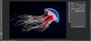
fig. 66, jellyfishes, Week 12 (08/11/2021)
Moving to the zeppelins! Using the same method and adding clipping mask and pink brush to the zeppelins, I made this:
fig. 67, zeppelins, Week 12 (08/11/2021)
I also added a blueish color for the zeppelin's shading, to add more balanced look between the elements:
fig. 68, zeppelins shading, Week 12 (08/11/2021)
Next is the clouds on the corner. Using the same method, match color, mask and brush, I smoothen the cloud so they blend a bit with the sky:
fig. 69, corner clouds, Week 12 (08/11/2021)
I applied surface blur for the castle, and it look liked this:
fig. 70, surface blur, Week 12 (08/11/2021)
Since, I planned to make those clouds a border, I simply just made the bottom and the top, then duplicate it. This is how it look now (Digital Draft 1):
fig. 71, Digital draft 1, Week 12 (08/11/2021)
Proceeding to the cutting, first I created a line where I planned to cut. I also created a backup layer for the person in case the cutting is wrong.
fig. 72, face cutting, Week 12 (08/11/2021)
fig. 73, face cutting 2, Week 12 (08/11/2021)
To make the edge smooth, I clip mask the picture to the line layer. It looked like this:
fig. 74, face cutting 3, Week 12 (08/11/2021)
Then, I add the clouds and castle as in my sketch before:
fig. 75, draft 2, Week 12 (08/11/2021)
I'm thinking that it was a little bit weird, and the objects crossed on each other, so I thought of changing it a bit.
I remembered that I want to move the jellyfishes. Theory said that jellyfishes has 2 kind of movement:
fig. 76, jellyfish movement, source; (https://images.app.goo.gl/17yXnMFzgK617LLz6) , Week 13 (15/11/2021)
So, I remade my jellyfishes by making the head and the body separated:
fig. 77, repairing jellyfish, Week 13 (15/11/2021)
I also added a whale, because I want it to look surreal. I cut it then using color match I adjust the color and used blending mode too:
fig. 78, whale, Week 13 (15/11/2021)
So, this is my final poster;
fig. 79, self titled poster final, Week 13 (15/11/2021)
EXECUTION (PHOTO ANIMATION)
First thing first, I created a copy of my Photoshop file. I did it to ensure I have a backup for my work. Also, I want to merge some layers that don't need to be animated. Here's how it looks:
fig. 80, AE assets, Week 13 (15/11/2021)
I started with creating new composition and import all the asset I arranged. After that, I arrange them. I just know that when we reduce opacity in Photoshop, when it's imported in AfterEffects, the opacity will reset to 100%, so I re-setting the opacity too:
fig. 81, new composition, Week 13 (15/11/2021)
fig. 82, arranged, Week 13 (15/11/2021)
Then, I started to make the animation. Started from the easiest first, the zeppelins. I planned to make some random move, I don't want to match the speed of each zeppelins movement, that's why I separated the layers.
fig. 83, zeppelins movement, Week 13 (15/11/2021)
Then, I proceed on moving the whale, this is how I did it:
fig. 84, zeppelins movement, Week 13 (15/11/2021)
Next, moving on to the main cloud and castle. I actually didn't plan to give it animation, but I want to try.
fig. 85, main cloud movement, Week 13 (15/11/2021)
As for my jellyfishes, I'm referencing to this tutorial:
fig. 86, making jellyfish movement, source; (https://www.youtube.com/watch?v=xX2e3CeyIQA) Week 13 (15/11/2021)
First, I started with the head movement. I used Effect > Distort > Warp to make the expanding part of the jellyfishes.
Then, I adjusted the feet.
fig. 87, jellyfishes movement, Week 13 (15/11/2021)
I thought it's not smooth enough and actually a little bit weird. I planned to adjust it later.
This is my draft for now:
fig. 88, animation draft 1, (https://youtu.be/n3F232T7bTM), Week 13 (15/11/2021)
I started to continue adjusting my animation. Based on the feedback that Mr. Martin gave, Mr. Martin said to connect the cloud and castle together, so I'm adjusting both layers.
I also planned to add twinkling stars in the sky, I used this:
fig. 88, source; (https://unsplash.com/s/photos/starry-sky), Week 14 (22/11/2021)
This is how it looked like:
fig. 89, Stars, Week 14 (22/11/2021)
I just remembered that AfterEffects can't read some settings that we've made in Photoshop, so, I changed the starry images into stars that I made using brush:
fig. 90, Redrawn Stars, Week 14 (22/11/2021)
Thus, I started to finalize my project since it's the week of submission. For my animation, I added this soundtrack. It's a good song from Ghibli that made like a music box song:
fig. 91, Ghibli Music Box, source; (https://youtu.be/punwtpf-KHI), Week 14 (22/11/2021)
SUBMISSIONS:
1. Still Image
fig. 92, Self-Titled (Final) JPG, Week 14 (22/11/2021)
fig. 93, Self-Titled (Final) PDF, Week 14 (22/11/2021)
2. Animated
fig. 94, Self-Titled (Final) MP4, source; (https://youtu.be/IlerIccVejw), Week 14 (22/11/2021)
Size: 1080 px (width) : 1920 px (height)
Artist Statement:
"Nirvana. An ideal place where it doesn’t exist in reality; a place where one can feel peace without suffering."
With this “Self-Titled” Project, I want to represent myself, someone who really loves fiction, surreal things, with touches of dreamy and calming feeling combined with childishness traits.
Through this design, I want to present my feelings about my ideal world. Using contrasting elements (e.g. whale and airships) in one place, I want to describe the idea of freedom – where we can dream of anything that we wanted to be. Some elements (e.g. castle, cloud, stars) were used to represent the dream of a little girl, being a princess. I want to deliver the representation of the “princess” in my own Nirvana.
This is myself, someone who likes to dream about things and I’m the princess of my own world. I feel calm and peaceful when I’m in my world.
3. Google Slide Progression
fig. 95, Self-Titled (Slide) Final, Week 14 (22/11/2021)
FEEDBACKS
WEEK 10: n/a
WEEK 11: n/a
WEEK 12:
Good concept. can go with sketch 1 or 2. Mr. Fauzi liked sketch 2 better, but up to you to choose which one. For the photography should be taken from various angles so can choose which one fit better.
Good concept. can go with sketch 1 or 2. Mr. Fauzi liked sketch 2 better, but up to you to choose which one. For the photography should be taken from various angles so can choose which one fit better.
WEEK 13:
Mr. Martin recommended me to place the zeppelins higher, and smaller the moon. Mr. Martin also recommended me to adjust the castle a bit so it look like it's growing from the head. For the spacing, needs to smaller the elements a bit.
Mr. Martin recommended me to place the zeppelins higher, and smaller the moon. Mr. Martin also recommended me to adjust the castle a bit so it look like it's growing from the head. For the spacing, needs to smaller the elements a bit.
WEEK 14:
Already good, but the castle will be better if attached to the cloud. Overall good progression, good composition, strong theme, well done!
REFLECTION
I learnt more about myself, because this project required me to do so. I learnt to know my strengths, weaknesses, hobbies, favorite things, better than ever. I also feel very happy of doing thins project, because it represent my favorite thing; fantasy!
In terms of technical, I learnt a lot; especially about AfterEffects. I was so blind when Mr. Martin taught me about AfterEffects at first, I have to rewatch the lecture and searched for some YouTube tutorials to catch up. Because of this project, I have learnt more skill for animating in AfterEffects. The key is to keep being curious and thirsty of knowledge.


Comments
Post a Comment