DPI / PROJECT 1
23.8.2021 - 20.9.2021 (Week 1 - Week 5)
Abigail Kartika Darmowinoto / 0350525 / Bachelor of Design in Creative Media
Digital Photography and Imaging / Taylor's University
Project 1: Collage Design
LECTURES
Digital Photography and Imaging / Taylor's University
Project 1: Collage Design
LIST
LECTURES
<back to top>


FEEDBACKS
REFLECTION
Week 1 (23/08/2021) : Subject Outline & Expectations
Today, August 23rd, the first class, which is Digital Photography and Imaging began. The class was quite fun, and Mr. Martin told us about how the class is going to work, and what things we should do in his class. The class is about general information, such as MIB (Module Information Booklet), what software do we need, and general information about the Digital Photography and Imaging course.
After that, Mr. Martin gave us some brief introduction lecture about Photoshop. Mr. Martin told us the benefit of learning Photoshop. For Graphic Designer, there are some benefits of learning Photoshop, they are;
1. To express designer's creativity

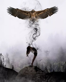
fig. 1, Fantasy Photography Art, source; (https://id.pinterest.com/pin/385972630573795987/), Week 1 (23/08/2021)
2. To create graphic design

fig. 2, Graphic Design Example, source; (https://www.cubagallery.co.nz/blogs/news/poster-design-everyday), Week 1 (23/08/2021)
3. To restore old images

fig. 3, Old Photo Restoration, source; (https://damagedphotorestoration.com/blog/how-to-guide/how-to-fix-a-ripped-photo-in-photoshop.html), Week 1 (23/08/2021)
4. To integrate graphics with text in artistically way

fig. 4, Graphic and Text Design Example, source; (https://id.pinterest.com/pin/281404676694908435/), Week 1 (23/08/2021)
5. To make use of brushes

fig.5, Photoshop Brushes, source; (https://speckyboy.com/free-photoshop-brushes/), Week 1 (23/08/2021)
6. To change photo colour

fig. 6 Changing Colour, source; (https://photoshoptrainingchannel.com/change-colors-in-lightroom/), Week 1 (23/08/2021)
7. To rectify mistakes in photographs
fig. 7, Photo Rectifying, source; (https://docs.google.com/presentation/d/1EUvnBjqynBJWAcXF6dGvpHrWOWP9L-l2XwIEMfT7xPY/edit#slide=id.g7a07e66e7a_0_440), Week 1 (23/08/2021)
Then, Mr. Martin gave us 10 tips on how to be a successful designer. Those are;
- Follow the tutorials
- Do a lot of experience to be familiar with the software
- Memorise all keyboard shortcuts
- Try to replicate others
- Participate in design competition
- Subscribe to online galleries
- Use smart objects
- Scale artwork and proportion
- Use action
- Use folder to organise things
Week 2 (30/08/2021) : Introduction to Composition
In the second meeting, Mr. Martin lectured us about composition. To make a good composition, we have to pay some attention to the basic things, such as;
- Focal Point
The focal point is a thing that we want to tell to the readers / viewers of our design. It'll be the main idea that we want to be focused. The concept is synonymous to emphasis.
fig. 8, Example of Vocal Point, source; (https://docs.google.com/presentation/d/1EUvnBjqynBJWAcXF6dGvpHrWOWP9L-l2XwIEMfT7xPY/edit#slide=id.g7a07e66e7a_0_440), Week 2 (30/08/2021)
- Scale & Hierarchy
Used to help communicate hierarchy by drawing attention toward and away from certain elements.
fig. 9, Example of Vocal Point, source; (https://docs.google.com/presentation/d/1EUvnBjqynBJWAcXF6dGvpHrWOWP9L-l2XwIEMfT7xPY/edit#slide=id.g7a07e66e7a_0_440), Week 2 (30/08/2021)
- Balance
In order to make balance, we should consider the weight. "Smaller objects ‘weigh’ less than larger objects, and heavily textured elements might ‘weigh’ more than flatly coloured elements," Mr. Martin said.

fig. 10, Example of Balance, source; (https://visme.co/blog/visual-hierarchy/), Week 2 (30/08/2021)
- White Space
White space means empty space. The more white space in design, the more minimalistic it'll look. White Space doesn't always mean the 'blank space', it can be gap between the object, etc.

fig. 11, Example of White Space Utilisation in UI Design, source; (https://medium.muz.li/the-effective-utilization-of-white-space-in-ui-design-c944009b2540), Week 2 (30/08/2021)
After the basic introduction of composition, Mr. Martin taught us about Rule of Thirds and Golden Ratio. So, what are they?
- Rule of Thirds
Rule of Thirds means dividing your design into thirds, using two horizontal and vertical lines, which will create a nine parts with four intersection points. It'll look like this;
fig. 12, Rule of Thirds, source; (https://docs.google.com/presentation/d/1EUvnBjqynBJWAcXF6dGvpHrWOWP9L-l2XwIEMfT7xPY/edit#slide=id.g7a07e66e7a_0_440), Week 2 (30/08/2021)
Then, Mr. Martin gave us tips on using rule of thirds by showing this video:
fig.13, Rule of Thirds Trick, source; (https://www.youtube.com/watch?v=7ZVyNjKSr0M), Week 2 (30/08/2021)
- Golden Ratio
A guideline to determine a design's proportion to create an aesthetic and pleasing design to the eye. It's usually found in nature, but can be implied in design.
fig. 14, Rule of Thirds, source; (https://docs.google.com/presentation/d/1EUvnBjqynBJWAcXF6dGvpHrWOWP9L-l2XwIEMfT7xPY/edit#slide=id.g7a07e66e7a_0_440), Week 2 (30/08/2021)
Week 3 (06/09/2021) : Introduction to Photoshop I
Mr. Martin gave us an introduction to Photoshop. After Mr. Martin gave us a brief lecture about Photoshop Tool, especially Pen Tool, Magic Wand, and Lasso Tool, he started to demonstrated it on screen.
First, he introduced us about the Toolbar in Photoshop.
fig. 15, Photoshop Toolbar, source; (https://docs.google.com/presentation/d/1ieD5ozkxw8FjuT5QeAtxT71uXQ-pfaWwk10yP2AyksY/edit#slide=id.ged7d141479_1_6), Week 3 (06/09/2021)
Then he taught us about the four tools that will be used on the exercise, started with Marquee Tool, Lasso Tool, Pen Tool, Magic Wand, and lastly, layers.
fig. 16, The Selection Tool, source; (https://docs.google.com/presentation/d/1ieD5ozkxw8FjuT5QeAtxT71uXQ-pfaWwk10yP2AyksY/edit#slide=id.ged7d141479_1_6), Week 3 (06/09/2021)
- Marquee Tool (key shortcut = M)
fig. 17, Rectangular Marquee Tool, source; (https://thenounproject.com/term/rectangular-marquee-tool/177529/), Week 3 (06/09/2021)
- Made by creating shape
- To select and mask
- There are 4 type of selections;
- Rectangular
- Elliptical
- Single row
- Single column
- Lasso Tool (key shortcut = L)
fig. 18, The Selection Tool, source; (https://docs.google.com/presentation/d/1ieD5ozkxw8FjuT5QeAtxT71uXQ-pfaWwk10yP2AyksY/edit#slide=id.ged7d141479_1_6), Week 3 (06/09/2021)
- Made by drawing
- To draw and pinpoint specific areas
- There are 3 type of lasso tool;
- Lasso tool = freeform
- Polygonal lasso = to create straight line lasso
- Magnetic lasso
- Pen Tool (key shortcut = P)
fig. 19, Pen Tool, source; (https://www.pngitem.com/middle/oiiwbJ_pen-tool-vector-png-clipart-png-download-pen/), Week 3 (06/09/2021)
- Made by adding pen and anchor
- To create a path from scratch
- To create extremely precise shapes and paths
- There are 5 type of lasso tool;
- Pen tool
- Freeform pen tool
- Add anchor
- Delete anchor
- Convert point
fig. 20, How to Use Pen Tool, source; (https://docs.google.com/presentation/d/1ieD5ozkxw8FjuT5QeAtxT71uXQ-pfaWwk10yP2AyksY/edit#slide=id.gd08f0b128a_0_58), Week 3 (06/09/2021)

fig. 21, Type of Pen Tool Line, source; (https://docs.google.com/presentation/d/1ieD5ozkxw8FjuT5QeAtxT71uXQ-pfaWwk10yP2AyksY/edit#slide=id.gd08f0b128a_0_58), Week 3 (06/09/2021)
- Magic Wand (key shortcut = M)
fig. 22, Magic Wand Tool, source; (https://www.pikpng.com/downpngs/hxTTJT_png-file-svg-magic-wand-photoshop-icon-clipart/), Week 3 (06/09/2021)
- Made by selecting a color
- There are 2 types of wand;
- Magic Wand Tool
- Quick Selection Tool
- Layers

fig. 23, Layer's Interface, source; (https://helpx.adobe.com/photoshop/using/layer-basics.html), Week 3 (06/09/2021)
A. Layers panel menu
B. Filter
C. Layer Group
D. Layer
E. Expand/Collapse Layer effects
F.Layer effect
G. Layer thumbnail
- Different images stacked on top of each other
- Form one final image without affecting another layers
- Used for non-destructive editing, never destroy the original
(Exercise is posted in exercise blog)
Week 4 (13/09/2021) : Introduction to Photoshop II
Mr. Martin introduced us to Photoshop editing. There are types of adjustment in Photoshop;

fig. 24, Adjustment in Photoshop, source; (https://www.cdgi.com/2016/04/mikes-technical-tip-adjustment-layers-photoshop/), Week 4 (13/09/2021)
So, here are the adjustment list;

fig. 25, Adjustment in Photoshop, source; (https://www.polishedpicture.com/photoshop-basics/photoshop-basics-layers-part-2-adjustment-vs-pixel-layers/), Week 4 (13/09/2021)

fig. 26, Mask, source; (https://www.polishedpicture.com/photoshop-basics/photoshop-basics-layers-part-2-adjustment-vs-pixel-layers/), Week 4 (13/09/2021)
To make any adjustment, it's better to make a mask. Mask is the one in the right. White means the adjustment is shown, when the color is black it's hidden. We can adjust the mask by using brush (B).
(Exercise is posted in exercise blog)
WEEK 5 : (20/09/2021) : Photo Manipulation
Week 5 lecture posted on here.
INSTRUCTIONS
<back to top>
<iframe src="https://drive.google.com/file/d/1pHwjSk8-Bzmv7iN9-yygmDtXXoOqL4yv/preview" width="640" height="480" allow="autoplay"></iframe>
WEEK 1
- Search for some old magazines / book to be cut into physical collage composition
WEEK 2
- Choose and identify your collage's design elements to be cut out and compose it into your own concept & story.
- Pre compositing your collage's design elements into a composition.
- Reference: https://youtu.be/2KqXGMf0HNk
- 3. Take 3 photo of your collage pre-composition and insert it on the section below
- 4. Submit (Turn In) this W2_TUTORIAL
- Summary: Start to make the 3 physical collage design.
WEEK 3
- Download all of the images here to your computer: https://drive.google.com/drive/folders/1cGcbENrjSksAaMQK9np2jb6ZaM7Y-81l?usp=sharing
- Follow this tutorial demo as reference to create your digital collage: https://youtu.be/A6ua6Fd3OWA
- Create 3 different composition digital collages from the images that you’ve downloaded.
- Create A4 canvas size (vertical) in Photoshop and start to do the compositions.
- Insert 3 photo of your digital collage compositions on the section below
- Submit (Turn In) this W3_DIGITAL_COLLAGE_1
- Summary: Do some adjustment to physical composition based on Week 3 feedback, then make 3 designs for digital collage using photos provided.
WEEK 4
- Attach your best composition from WEEK 3 digital collage exercise below.
- Using the same Photoshop file, improvise your WEEK 3 digital collage into WEEK 4 by
- using Adjustment Layers & Filters on Photoshop.
- Explain what you’ve learned in the description section.
- Summary: Do some adjustment to digital composition based on Week 4 feedback, then choose 1 to be final, and give some adjustment using mask that Mr. Martin has taught.
WEEK 5
- Final submission
PROJECT 1A : PHYSICAL COLLAGE
Mr. Martin asked us to find some old magazine pictures and cut it. Here are the elements I found:
(it should be more but some aren't documented)

fig. 27, elements, Week 1 (23/08/2021)
Then I searched something at my house to be the background. So, I found a brown paper.

fig. 28, brown paper, Week 1 (23/08/2021)
So, here are some of my collage designs; (it's not sticked yet)

fig. 29, collage 1, Week 2 (30/08/2021)
From this collage, I want to represent about a strong girl who endure her sadness. I used the waterfall to make her look crying, and a swing to make her look like a loner. The butterfly is some kind of her wing, and the flower will be her crown. I want to make her to look strong but deep down, she's trying to endure her loneliness.

fig. 30, collage 2, Week 2 (30/08/2021)
The second collage is about a compilation of different girls. I used the word 'heroes' as a word to implement women's power.

fig. 31, collage 3, Week 2 (30/08/2021)
The word 'beyond' means afar. I want to describe something afar. The circle define the time, and the Ferris wheel behind represent the past.
As I got my feedback form Mr. Martin, I was given a choice whether to continue the collage 1 or 2, because collage 3 lacks of elements.
I decided to continue collage 1, because I think its has more elements than the third. I was suggested to move the butterfly lower, so I did that. After that, I did some adjusment to some elements. I add a black paper and a word "metamorphosis" to make it easier to understand. So, here is my final output;

fig. 32, physical collage (final), Week 3 (06/09/2021)
fig. 33, physical collage PDF, Week 3 (06/09/2021)
EXERCISE 1B : DIGITAL COLLAGE
On week 3 we were provided with 15 images for us to make a composition. The composition should be A4 vertical size, and so, here're my results;
fig. 34, composition 1, Week 3 (06/09/2021)
Composition one is about a fight of fishes. Inspired from Godzilla vs Kong, I used the city as a place for them to fight.
fig. 35, composition 2, Week 3 (06/09/2021)
In composition 2, I want to tell a story of fishes' romance. The blue coloured fish is a female and the aquamarine coloured fish is a male. It's about a night date of them on a lake under the moonlight.

fig. 36, composition 3, Week 3 (06/09/2021)
The third composition is about a documentary of fishes. The typewriter and the documenter indicate the documentary. The two fishes are the main subject.
So, I did some adjustment to my third composition. I followed Mr. Martin suggestion. He recommended me to put some elements on my second composition to my third composition, so here it is;

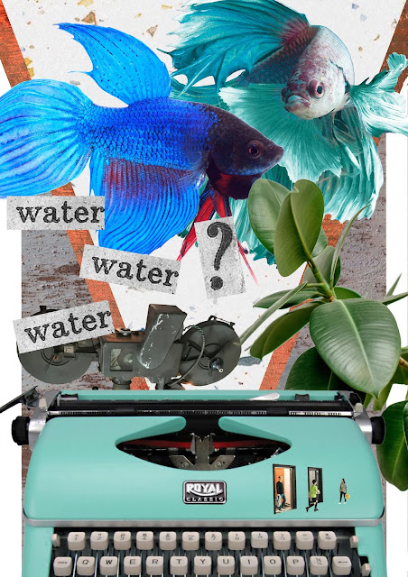
fig. 37, adjusted composition 3, Week 4 (13/09/2021)
The design is about a workspace with a lake view. I want to create something surreal. I planned as if the fishes were rising into the air and dancing under the moonlight. I used the word, “water water water?” to indicate that the fishes were confused because they suddenly moved out of the water. It can also tell a story about fish documentation. For this composition, I used mostly a magic wand tool and a polygonal lasso tool.
I want to make the composition look more magical, because “fishes rising and dancing under the moon” itself are somehow fictitious. I added a watery pattern to make the fish vibe stronger. I invert the leaves to make them look like purple petals, which I thought make the colour scheme look unreal. I also add aquamarine colour to some parts like the word “water water water ?” to make them look like they’re mossy.
Then, I used some effect on my composition. The most prominent adjustment I do was on the leaves, so here's how it looks:

fig. 38, edited composition 3, Week 4 (13/09/2021)
fig. 39, digital collage PDF, Week 4 (13/09/2021)
FEEDBACKS
Week 1:
- General Feedback : n/a
- Specific Feedback : n/a
Week 2:
- General Feedback : n/a
- Specific Feedback : n/a
Week 3:
- General Feedback : A composition sometimes is better with less/more elements. It depends.
- Specific Feedback : Composition number 1 and 3 can go, number 2 still lacks. For number 1, the wing should be placed lower.
Week 4:
- General Feedback : n/a
- Specific Feedback : Composition 2 or 3 can go. If I choose 3, I should do some adjustments. I should add some elements in Composition 2 to Composition 3.
Week 5:
- General Feedback : n/a
- Specific Feedback : n/a
REFLECTION
From this DPI first project, what I learned most is about making good composition. In this project also, I learned a lot about Photoshop tools. Until before Mr. Martin taught me about selection tools, the only tool I know is Magic Wand Tool. I finally had experiences using selection tool other than magic wand tool. I also just known how to use mask and adjustment in this project. I just know that I can do several types of adjustments using the tools that Photoshop provided. I know nothing at first, and it feels like unusual, hard, but as I did more practice, the more I became used to things that Mr. Martin had taught me. Patience and practise are needed to grow.


Comments
Post a Comment