Typography Task 3B / Type Design and Communication
29.10.2021 - 12.11.2021 (Week 10 - Week 12)


But thinking of it, not everyone knows that. So, my stickers are to give to people not only me, so I'm using the one which is people more familiar with.

I'm also planning to make the Christmas one to be cookie shaped.


I tried all the 10 typefaces to decide which one I'll go with:


I also thought of using the Taylor's logo as the stem, but I think it looks weird:


I add the text, first I added the basic text, then I go to Type > Create Outlines then Ungroup and arranged it to something like this:
I add mask to create a light effect from the pumpkin glow, it can be seen by this pathway:
I got an idea to put the Taylor's logo as a halloween's element that stab the pumpkin:
I added more detail for finishing, I added blood dripping effect and stronger the line shading. I also added vines. Finally here's my final preview:

For the curves like the "s," "m," and "c," I manually draw strokes using pen tool.

I used the Type > Create Outline > Ungroup method to adjust the letters:


Then, I added the shading. I planned to make a vector art, so I don't use gradient. I planned


Then, I proceed with coloring it. So this is my Black and White version.

Then, I fill the cookie:

In the end I choose this one as my texture;
I applied clipping mask within the cookie base, this how it looks like, and I'm quiet satisfied with my work:


I also tried to convert my animated sticker to What'sApp using sticker.ly again:
1. BnW Version


(Dark Mode)
FEEDBACKS
REFLECTION
FURTHER READING


Abigail Kartika Darmowinoto / 0350525 / Bachelor of Design in Creative Media
Typography / Taylor's University
Task 3(B) / Type Design and Communication
LECTURES
Typography / Taylor's University
Task 3(B) / Type Design and Communication
LIST
OTHER POSTS
LECTURES
TASK 1 LECTURE can be found here.
TASK 2 LECTURE can be found here.
TASK 3A LECTURE can be found here.
Final Compilation and Reflection can be found here.
Week 10 (29/10/2021):
Mr. Vinod gave us a brief introduction about typography task 3B, creating stickers. Some things are needed to note:
- Use the 10 typefaces
- Use a little graphical elements, not too much
- Use the appropriate color schemes, can search in web
- Can use any Adobe software for animating it, Photoshop, Illustrator, Premier, or After Effects.
- Canvas has to be 512 px : 512 px, can be bigger and compressed later
Week 12 (11/11/2021):
Mr. Vinod gave an announcement in the FB group:
"Students as it turns out, the process requires you to use Adobe After Effects to produce a .TGS file for the sticker animation (not more than 3 seconds long). Here are the instructions: https://core.telegram.org/animated_stickers
THAT SAID, if you are unable to brain the process because your After Effects is weak, then just create a Gif animation (not more than 3 seconds long) as done previously in class. Even though this can’t be converted into an actual Telegram sticker, it’s OK."
INSTRUCTIONS
<back to top>
<iframe src="https://drive.google.com/file/d/1_JYfWVZTe7oDL_0AAImBCEdqsEdKjEXO/preview" width="640" height="480" allow="autoplay"></iframe>
To do:We have to create a square sized greeting sticker to be used on Telegram. Stickers must be in two version, Black and White and Color. At the end of the task we have to animate the sticker and saved it to .GIF. Can use graphical elements to enhance stickers, but mustn't be dominating the typography.
Submissions:
BW option (2048px)
Colour option (2048px)
PDF of (BW & Colour)
Gif Sticker Animation (1024 or 800px)
Screen Grab
Colour option (2048px)
PDF of (BW & Colour)
Gif Sticker Animation (1024 or 800px)
Screen Grab
To note:
- All gathered information (failures, successes, epiphanies, sketches, visual research, printouts, websites, images, charts, etc.) must be documented logically and chronologically in the e-portfolio for the duration of the task in one post.
- All images/sketches/diagrams/scans must be captured/photographed/scanned well with good, even, natural light, without shadows — use of tube/bulb/flashlight is not allowed. All images/sketches/diagrams/scans must be labelled (fig 1.), described and dated. Final submission must be indicated clearly (distinguishable from process work) and uploaded as PDF and PNG &/ GIF (not JPG) or as instructed in class.
- (Only if instructed) Tasks to be documented in a printed A4 enclosed in a Clear Sheet, logically and chronologically. The works must be labelled and dated – use pencil and write neatly.
IDEA EXPLORATIONS
Before doing anything, I searched for some inspiration in Pinterest:
fig. 1, Sticker Inspirations 1, source; (https://id.pinterest.com/search/pins/?q=stickers%20inspiration&rs=typed&term_meta[]=stickers%7Ctyped&term_meta[]=inspiration%7Ctyped), Week 10 (29.10.2021)
When creating a Typography stickers, I thought of making something that has a fill between the characters, so it'll look more neat and nice. It would be something like this:
fig. 2, Sticker Inspiration 2, source;(https://pin.it/4kyKEKi), Week 10 (29.10.2021)
fig. 3, Sticker Inspiration 3, source;(https://pin.it/2ue4GSK), Week 10 (29.10.2021)
I actually have some stickers to make in my mind, but I'm not sure which should I focused on first. So, I brainstormed some ideas:
Halloween
Halloween is always identical to ghost, pumpkin, candy, scary things. I'm planning to make a pumpkin craving, Jack-o-Lantern inspired. But since it's more a typography dan illustration, I planned to change the base into typographies. So, I searched on some kind of pumpkin references:
fig. 4, Pumpkins, source; (https://pin.it/2ue4GSK), Week 10 (29.10.2021)
Since I intended to make the typography to be large, I'm looking for a pumpkin with balanced height and width. The shape of ghost pumpkin is cool but the longer I saw it, it looked like a garlic.. ._. So, maybe I'll go with the ghost pumpkin but more modified by the Jack o'Lantern. I really like the curves of Ghost Pumpkin, because the Jack o'Lantern one seems like it's monotonous.
Labor Day
When the topic is Labor Day, first thought that came in mind are workers, screw, bolt, hammer, anything like them, because it really indicates about "working", although it's more construction based. When searching on internet, I only can find some like this:
fig. 5, Labor Day Idea, source; (https://id.pinterest.com/search/pins/?q=labor%20day%20typography&rs=typed&term_meta[]=labor%7Ctyped&term_meta[]=day%7Ctyped&term_meta[]=typography%7Ctyped), Week 10 (29.10.2021)
When seeing the bolt, since it's circle, I got an idea to make it as the construction worker head, if not, I'll change the "o" of Labor Day into bolt.
Earth Day
I remembered the day when all lights have to be turned off for an hour as a celebration of earth day. I'm planning to make a typography using the help of illustration like lamp and grass. I want to make the type to be earth shaped. But, the more I think of it, I think it's too basic. I still wanted to use the earth concept, but I'm thinking of another alternative.
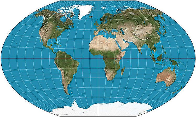
I remembered when I was in Elementary School, when we studied about geography and using Atlas, because of it's 2D characteristic, the shape of the earth is like pressed on the paper, making a kind of cylindrical shaped:
fig. 6, Earth, source; (640px-winkel-triple-projection-sw.jpg) Week 10 (29.10.2021)
If not, it would be something like this:
fig. 7, Map Projection Families, source; (https://docs.qgis.org/2.18/id/docs/gentle_gis_introduction/coordinate_reference_systems.html) , Week 10 (29.10.2021)
Christmas
Talking about Christmas, all I know is joy, warmth, and festive vibes. Based on an article by Wikipedia about Christmas Decoration, in western world, there are some things that are identical to Christmas, such as; bells, reindeer, candles, candy canes, garland, stockings, wreaths, snow globes, angels. (I mentioned it in Further Reading). I'm planning to make sleigh. Surprisingly I found out my sketch is similar to my friend's sketch in class. I thought of how to make it different.
Then, I remembered the time when I was a child and my grandmother sometimes invite me to go to her house to make cookies. We made the cookies based on some shape like candy canes, snowman face, Christmas tree, etc. I thought Gingerbreadman cookies were very mainstream.
I was inspired to make something like that, but with different shapes. So, I searched some inspirations in Pinterest:
fig. 8, Christmas cookie, source; (https://id.pinterest.com/search/pins/?q=creative%20christmas%20cookie&rs=typed&term_meta[]=creative%7Ctyped&term_meta[]=christmas%7Ctyped&term_meta[]=cookie%7Ctyped) , Week 10 (29.10.2021)
SKETCHES
So, I actually have no idea which one to choose, so I made some sketches. These are the descriptions:
- Happy Halloween is a pumpkin lantern carving.
- In Labor Day, I planned to use construction workers as the element.
- T in Happy Father's Day is a tie to describe "man" "father".
- A in Happy Birthday is a party hat and the wavy thing in the "y" is like a ribbon.
- The concept of of Earth Day is when we have to turn off the lights for an hour.
- The "s" in friendship day defines the infinity of a friendship.
- Merry Christmas concept is Santa on sleigh.
fig. 9, sketches, Week 10 (29/10/2021)
I'm asked to choose 1 or 2 and explore more. I think I prefer the Halloween one and the sleigh one because I can play with the color later. Mr. Vinod also gave me feedbacks, if I make the halloween, make sure to use clipping mask.
BNW DIGITIZATION
- HAPPY HALLOWEEN A
For the black and white digitization, first, I created my pumpkin base using the pen tool:
fig. 10, Halloween A tracing, Week 11 (05/11/2021)
Then, I adjust the shape a bit and planned how the gradient will look like:
fig. 11, Halloween A gradient, Week 11 (05/11/2021)
fig. 12, Halloween A gradient detail, Week 11 (05/11/2021)
fig. 13, Halloween A selection, Week 11 (05/11/2021)
I decided to use Bembo Std Extra Bold, because of its strokes. I planned to make the text following the pumpkin's texture:
fig. 14, Halloween A path, Week 11 (05/11/2021)
fig. 15, Halloween A stem, Week 11 (05/11/2021)
I thought my design doesn't fully fit the canvas, so I decided to stretch the pumpkin a bit, I also changed my text to be separated by changing it first into Type > Create Outline > Ungroup. I remake it the shape. I also adjusted and added gradient. I planned to make a very contrast color between the text and the pumpkin.
fig. 16, Halloween A final BnW, Week 11 (05/11/2021)
- HAPPY HALLOWEEN B
I kind of feeling not enough for the Happy Halloween A, so I tried to make something out of vector art. First, I trace the shape of the previous pumpkin:
fig. 17, Halloween B outer area, Week 11 (05/11/2021)
Then I add the inner pumpkin:
fig. 18, Halloween B inner area, Week 11 (05/11/2021)
I think of making some shading:
fig. 19, Halloween B shading, Week 11 (05/11/2021)
fig. 20, Halloween B type, Week 11 (05/11/2021)
fig. 21, Halloween B masking, Week 11 (05/11/2021)
fig. 22, Halloween B stabbed, Week 11 (05/11/2021)
fig. 23, Halloween B final BnW, Week 11 (05/11/2021)
- MERRY CHRISTMAS
After comparing each of the 10 typefaces, I made a decision to use combination of Futura and Garamond. Actually I want to focus the typeface more on Futura, Garamond will only be the supporting element, like for letter "t" and "a". So, I traced my sketch:
fig. 24, Merry Christmas, Week 11 (05/11/2021)
fig. 25, Merry Christmas strokes, Week 11 (05/11/2021)
fig. 26, Merry Christmas ungroup type, Week 11 (05/11/2021)
So, this's how it looks.

fig. 27, Merry Christmas preview, Week 11 (05/11/2021)
Then, I moved it to the 512 x 512 px canvas to see whether it fits. I adjust some, like the top of the sleigh to fit more with the canvas. This's how it looks:
fig. 28, Merry Christmas preview, Week 11 (05/11/2021)
I was thinking that it doesn't really fit in the square frame, so I adjust them a bit:
fig. 29, Merry Christmas adjusted fit 2, Week 11 (05/11/2021)
Then, I added something that looks like a fill for the sticker, and when looking at it, I was thinking of it as a Christmas cookie, and all the elements on the top of the fill are the icings.
fig. 30, Merry Christmas filled, Week 11 (05/11/2021)
fig. 31, Merry Christmas filled gradient, Week 11 (05/11/2021)
I'm thinking of adding some glossy light for the icing, so I add some highlight:
fig. 32, Merry Christmas highlight, Week 11 (05/11/2021)
I got an idea to add Christmas tree ornaments:
fig. 33, Merry Christmas ornaments, Week 11 (05/11/2021)
As my feedback on week 11, Mr. Vinod recommended me to add some cookie bumps effect, so I'm using texture to do that. So, this is my final:
fig. 34, Merry Christmas final BnW, Week 12 (12/11/2021)
COLOR DIGITIZATION
- HAPPY HALLOWEEN A
So, my concept is a jack o'lantern pumpkin, which is the most iconic thing on Halloween. I searched for some pictures on how it looks:
Then, I searched some color scheme inspiration in Adobe Color:
fig. 35, Halloween Palette, source; (https://color.adobe.com/search?q=halloween), Week 11 (05/11/2021)
After I choose my color pallete, I began to recolor my pumpkin. It's actually a freeform gradient, so I just need to change the color per points. I also planned to make a gradient in the text, so I made a random shape between the text, then I add the gradient. After that I used clipping mask and here's how it look:
fig. 36, gradient, Week 11 (05/11/2021)
I add a shade between the sentences to make it more contrast. This's how I did it:
- Create the path between the text and add shadow color
- Apply Gaussian Blur ( Edit > Blur > Gaussian Blur)
fig. 37, clip mask, Week 11 (05/11/2021)
This is how it looks. I still have to finalized it though.
fig. 38, Happy Halloween A (final), Week 11 (05/11/2021)
- HAPPY HALLOWEEN B
My concept is actually the same as Happy Halloween A, the difference is on the style that I'm using.
After I finished my BnW version and found my color palette, I started to color the base:
fig. 39, Happy Halloween B fill, Week 11 (05/11/2021)
Then the shading effect:
fig. 40, Happy Halloween B shading, Week 11 (05/11/2021)
The Taylor's logo:
fig. 41, Happy Halloween B Taylor's logo colored, Week 11 (05/11/2021)
Then the text and the mask. For the mask actually I just have to select the previous mask and set the color:
fig. 42, Happy Halloween B masking, Week 11 (05/11/2021)
Then, moving forward to the details, and yay!
fig. 43, Happy Halloween B (final), Week 11 (05/11/2021)
- MERRY CHRISTMAS
I searched for some color palette ideas of Christmas in Adobe Color.
fig. 44, Christmas color palette, source; (https://color.adobe.com/search?q=christmas), Week 11 (05/11/2021)
I'm interested with the fourth from the top. I was thinking of making something like that. I think my color palette research in Adobe Color isn't enough yet because I haven't find anything suitable for my design, thus, I proceed to Google. I found this color palette:
fig. 45, Christmas color palette 2, source; (http://cifi.it/notes.asp?iid=158968474-christmas+palette&cid=6), Week 11 (05/11/2021)
fig. 46, Merry Christmas BnW, Week 11 (05/11/2021)
I think I'm quite satisfied with the black and white version. But, I noticed that I forgot to shade some part of the texts and the shadow in letter "M" is kind of weird. So I planned to adjust them a bit, and add the base color:
fig. 47, Merry Christmas base colored, Week 11 (05/11/2021)
fig. 48, Merry Christmas fill colored, Week 11 (05/11/2021)
Then, I added the shading:
Then the ornaments:


fig. 49, Merry Christmas shading, Week 11 (05/11/2021)
Then the ornaments:
fig. 50, Merry Christmas ornaments, Week 11 (05/11/2021)
After that, I added the highlights:
fig. 51, Merry Christmas highlights, Week 11 (05/11/2021)
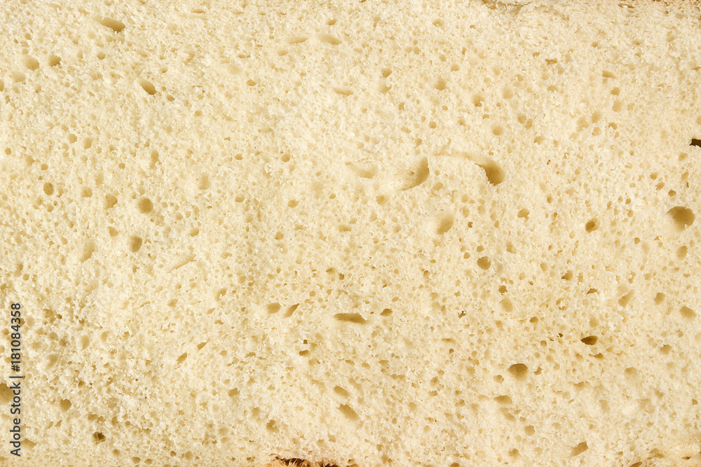
Mr. Vinod told me to add some texture / stippling effect to make it more like a cookie, so I add the effect, first, I searched from Adobe Stock for some cookie texture:
fig. 52, Merry Christmas texture 1, source; (https://stock.adobe.com/id/search?k=biscuit+texture&search_type=recentsearch), Week 11 (05/11/2021)
fig. 53, Merry Christmas texture 2, source; (1000_F_181084358_wqCY5cwQJvwuWgxhdQGqheOCEYcyHE93.jpg), Week 11 (05/11/2021)
fig. 54, Merry Christmas clip mask texture, Week 11 (05/11/2021)
GIF ANIMATION
I'm planning to make the biting effect on Illustrator, but, I noticed that it'll be so hard since the elements are separated in each layer. So, I made it on Photoshop and then I'll be moving it to AfterEffects.To make a biting effect, first, I marked on the areas that'll be bitten:

Then using the selection tool, and change the selection into inverse, I erased the area that are bitten:

I did it all to the area that I marked, and I preview it on timeline:


fig. 55, Merry Christmas animation 1, Week 12 (12/11/2021)
fig. 56, Merry Christmas animation 1, Week 12 (12/11/2021)
I did it all to the area that I marked, and I preview it on timeline:
fig. 57, Merry Christmas animation 1, Week 12 (12/11/2021)
I think the teeth size are so inconsistent. So, I remake it using circle shape and remove the area covered with the circle. I made it per bite I intended to make.
fig. 58, Merry Christmas animation 2, Week 12 (12/11/2021)
After I'm done, I moved it to AfterEffects:
fig. 59, Merry Christmas animation 2, Week 12 (12/11/2021)
After I'm done, I rendered it using Adobe Media Encoder:
fig. 60, Merry Christmas GIF 2A, Week 12 (12/11/2021)
But turns out, the background isn't transparent, and also I noticed I haven't add some cookie crumbles, so I add it and made it back from. I also think of another way to export it into transparent. So, I watched some videos in YouTube. Some didn't work, but finally I knew the way to make it transparent.
First, I export it using AfterEffects, and the file output will be .mov, and the setting also have to use RGB + Alpha and Quicktime. Then, move it to Photoshop. In Photoshop open File > Import. Then, Import form Videos File to Layer. We'll see that our videos are converted into layers. All we have to do is importing it the same way as importing the GIF like in the tasks before.
Here's the final:
fig. 61, Merry Christmas GIF Final, Week 12 (12/11/2021)
STICKER CONVERTING
After I export both of my final artboards to .png file type, I opened Telegram. The "Stickers" bot keep sending me this message:

I went out with another alternative which Mr. Vinod taught us. I went to "Stickerator" bot and uploaded my file, then I forwarded it to "Stickers" bot:


Here's the preview:
Optional, but, I want to try to add my stickers to What's App too. I use Sticker.ly, an application to add images / GIFs / videos to What's App. It's free to download on PlayStore and AppStore. So, here're the process:
First, I add choose create sticker.

We can also adjust the sticker (optional):


After that, we have to make a pack name, and finally, our stickers will appear like this:

After I export both of my final artboards to .png file type, I opened Telegram. The "Stickers" bot keep sending me this message:
fig. 62, error, Week 11 (05/11/2021)
I went out with another alternative which Mr. Vinod taught us. I went to "Stickerator" bot and uploaded my file, then I forwarded it to "Stickers" bot:
fig. 63, making process, Week 11 (05/11/2021)
Here's the preview:
(Light Mode)
(Dark Mode)
fig. 64, Telegram preview, Week 11 (05/11/2021)
Optional, but, I want to try to add my stickers to What's App too. I use Sticker.ly, an application to add images / GIFs / videos to What's App. It's free to download on PlayStore and AppStore. So, here're the process:
First, I add choose create sticker.
fig. 65, making WA sticker, Week 11 (05/11/2021)
We can also adjust the sticker (optional):
fig. 66, making WA sticker process, Week 12 (12/11/2021)
After that, we have to make a pack name, and finally, our stickers will appear like this:
fig. 67, WA sticker preview, Week 12 (12/11/2021)
All we need to do is click on the Add to What'sApp, and Voila! Here're the previews:
(Dark Mode)
(Light Mode)
fig. 68, WA sticker preview chat, Week 12 (12/11/2021)
I also tried to convert my animated sticker to What'sApp using sticker.ly again:
First, I added my sticker to Sticker.ly

Then after following the process, we can see it after we create our pack:
fig. 69, WA animated sticker making, Week 12 (12/11/2021)
fig. 70, WA animated sticker preview, Week 12 (12/11/2021)
Preview:
Telegram stickers can be downloaded here.
What'sApp stickers can be downloaded here.
What'sApp animated sticker can be downloaded here.
fig. 71, WA animated sticker preview chat, Week 12 (12/11/2021)
What'sApp stickers can be downloaded here.
What'sApp animated sticker can be downloaded here.
FINAL SUBMISSION
fig. 72, Typo Task 3B BnW final (PNG), Week 12 (12/11/2021)
fig. 73, Typo Task 3B BnW final (JPG), Week 12 (12/11/2021)
fig. 74, Typo Task 3B BnW final (PDF), Week 12 (12/11/2021)
2. Color Version
fig. 75, Typo Task 3B Colored final (PNG), Week 12 (12/11/2021)
fig. 76, Typo Task 3B Colored final (JPG), Week 12 (12/11/2021)
fig. 77, Typo Task 3B Colored final (PDF), Week 12 (12/11/2021)
3. PDF of BnW and Colored
fig. 78, Typo Task 3B BnW & Colored final (PDF), Week 12 (12/11/2021)
4. GIF sticker animation
fig. 79, Typo Task 3B GIF final (GIF), Week 12 (12/11/2021)
fig. 80, Typo Task 3B GIF final (Embed), Week 12 (12/11/2021)
5. Screen grab and Download Link
- Telegram
(Light Mode)
(Dark Mode)
fig. 81, Telegram sticker final (preview), Week 12 (12/11/2021)
- What'sApp
(Light Mode)
fig. 82, What'sApp sticker final (preview), Week 12 (12/11/2021)
- What'sApp Animation
fig. 83, What'sApp animated sticker final (preview), Week 12 (12/11/2021)
FEEDBACKS
WEEK 11
- General feedback:
- Screen square is small, so better to maximise it
- Create in a square so you know how it'll look
- Consider the positive and negative spaces
- Specific feedback:
- Lots of different things happening, should choose 1 or 2 and explore it more
- The pumpkin can work, make sure to use clip mask so it fits in the pumpkin and the words need to be kern a bit
- Must be within the sketch
WEEK 12
- General feedback:
- Don't use to many graphical elements
- Taylor's logo musn't be distorted
- Loop animations for submission
- Resize to 2048 px for submission, 1024 px for animation
- Specific feedback:
- It's good, can add stippling effect to make it more cookie.
- General feedback:
- n/a
- Specific feedback:
- Excellent documentation of progress.
- Good job on the sticker.
- The TU mark's vertical stripes look a little thinner than usual—if yes, would be great if youre able to revert to the original for only the static).
REFLECTION
-Experience:
This is the second most exciting task I had, the first one is the Task 3A. Why do I like it? I like it because this's one of the Typography task we had that use colors!! It's a very fun thing to do. I also got a chance to learn to make things that is intended for screen use. But, since it's a typography class, it's so hard to focus more on the typography rather than the illustrations-things that I really love to do.
-Observation:
I noticed that, when making the stickers, it's better to think of their readability rather than the aestheticness. The challenge is to make a stickers that people can experience it, understand it, and stickers although some stickers are intended to be aesthetic, when coming up to typographical stickers, the most crucial part is the readability. Screen size and our artboard size are two different things, so it's better to be very big in our artboard rather than to small on the chat screen.
-Finding:
I learnt a lot in this exercise. I found out that, if I was more focused with one idea, it's easier to explore. I also learnt some new things like, how to export GIF in transparent background, how to add texture in Adobe Illustration, experiencing with colors, etc.
FURTHER READING
(all images are sourced from the book/webpage)
Christmas Decoration
Christmas decorations are several ornament that is used for Christmas, and they're as old as the Christmas itself. The traditional colors used are pine green, snow white, heart red. There're also some metallic colors that are popular to use; gold and silver. There're also some typical images that are used widely as Christmas ornaments, such as, Santa, baby Jesus, Father Christmas, and Star of Betlehem.
There're some type of decorations used over all cultures:
- Glass ornaments
- Method (a clear glass tube is heated over an open flame)
- Cotton batting
- Dresden
Popular plants for Christmas:
- Holy
- Mistletoe
- Ivy
- Christmas tree
In western world, usually, rolls of brightly colored paper with secular or religious Christmas / winter / Hanukkah motifs are used. Besides that, display of Christmas Villages are used too.
Several type of ornaments are used too:
- Bells
- Reindeer
- Candles
- Candy Canes
- Garland
- Stockings
- Wreath
- Snow globes
- Angels
WEB REFERENCE:
Wikipedia. (n.d.). "Christmas decoration", accessed on November, 5 2021 (21.04, UTC+7), https://en.wikipedia.org/wiki/Christmas_decorationThe Fundamental of Typography
COLOUR
Color works with typography in many ways. It helps impart information and enhance the overall visual effects of a design.
- Colors can be used to provide
- Visual Hierarchy : colors can provide definitions, contrast, add meaning to the text.
- Balance : colors can describe balance between black and white on a page of text
- Specifying color
- RGB : on screen use
- CMYK : printing
- Note: higher percentage = stronger color. Lower values mixes produce inconsistent color.
fig. 84, color, Week 10 (29/10/2021)
- Color association
- Certain colors are associated with particular meaning, e.g:
- Red (China) = celebration and luck > used in wedding and funeral
- Red (Eastern) = joy
- Red (Western) = danger
- Blue (Hindus) = sacred color, color of Krishna
- Blue (Jewish) = holy
- Blue (China) = immortality
- White (Western) = wedding
- White (Eastern) = mourning, symbolizing death
- Etc.
- Threshold
fig. 85, threshold, Week 10 (29/10/2021)
- Increasing a type size may add pixels to the stem which is known as threshold. It won't be a problem in higher resolutions. Anti aliasing is used to counter the problem.
- Anti-Aliasing
fig. 86, anti-aliasing, Week 10 (29/10/2021)
- A process to reduce pixelated effect on images by smoothing jagged appearance of diagonal lines in a bitmapped image.
- Type as image
- Although type function is to communicate words, some also used as a graphic device that speaks more through its visual representation than the meaning of the constituent letters. Examples; logos:
fig. 87, type as image, Week 10 (29/10/2021)
Reference:
Ambrose, Gavin & Harris, Paul. (2006). The Fundamentals of Typography. AVA Publishing SA.


Comments
Post a Comment