DESIGN EXPLORATION / PROJECT 2

Abigail Kartika Darmowinoto / 0350525 / Bachelor of Design in Creative Media
Design Exploration / Taylor's University
Project 2 : Design Expansion
OTHER POST
INSTRUCTIONS
<back to top>
fig 2.1 Module Information Booklet of Design Exploration
fig 2.2 Design Exploration Project Brief
PROGRESSION
In the next project, project 2, we were required to further explore our design to create something new that preferentially things we never try before or something that we want to try.

Based on my previous design, I was a bit clueless on what can I do at first, as it’s more to an illustration that a bit difficult to implement on other form because of the theme I chose. (like if I choose my lunar new year idea maybe I can actually implemented it to like an app that tells fortune about chinese new year or some zodiac reading - I just don’t have any clue on what to do for my illustration)
Thus as I brainstormed several ideas, I found myself with my old passion on creating an animation using mental canvas, where we can zoom and play with the perspective. Okay, seems fun and doable for my illustration.
Thus, I started to do my first step of my project, doing the artboard of the sketches. I try to ideate on what I want to tell to the audience.
So the big idea is about from the pov of the person while sliding the skateboard, which represents present times (2000ish) that move and shows the surroundings area and see the landscape of current modern city and came through a portal and found herself on a different futuristic city (the previous illustration landscape) and move her perspective into seeing the ground where she’s sliding with the hoverboard (the futuristic representation of skateboard).
So here’s my sketch;

I found out that Ms. Anis liked my idea back on my feedback session, and she mentioned that she likes how I put my transition. However Ms. Anis reminded me to do a backup plan incase anything goes wrong, which I haven’t thought of it.
Okay, what should I do?
After several thoughts for a week, I haven’t find an idea for my project, and for a sudden moment I tried to think of something else, I came up with an idea, why don’t I make an insurance website but of course using parallax style, like this website: https://the-goonies.webflow.io/

And as I proceed on creating the parts for my mental canvas, I realized that I made the artwork layers super messy and not in a clear state where all lineart is not erased :”)

As someone who rarely works with an illustration, I feel that the mess is to fatal for me to make the mental canvas, as that mean I have to make several artworks for the present landscape and future landscape which I feel like I can’t draw that precise and fast, and the ornaments are already mixed.
First I decided to fix the broken / cut off layers, which I focus on adding the left part of the image, as the buildings are simpler, and making the movement to the right, so the part that will be shown is the left part. It's a bit time consuming.
- Before

- After

1. WEBSITE
Thus I decided to do the website design, but as an exploration, I want to try making something different than I made usually, I want to try experimenting with javascript coding.
As a start, I planned it to make the main home screen to move on scroll, so I watched several youtube tutorials on how to do that and I managed to implemented it on my website, on scroll the element go as directed.
Phew, at least I managed to finish the main part of the website. I showed it to Ms. Anis and she said she’s proud of me for doing it for the first time using javascript.
I feel some of my problems gone, and the next step is that I want to try other form of javascript as well where previously I used “let” command, now I tried to use “const” command to control a counter function.
The counter function works when you scroll down, the number will move from 0 to the designated numbers you wrote on the command.
Watching a youtube video, asking chatgpt, and even asking my senior how to stack the code on javascript, I learned new knowledge about javascript and I feel like it’s not as super difficult as I think, I’ve been having a mindset that javascript is confusing - maybe in the actual form of work, yes, but for a tiny bit of spices for my coding website, I feel like it’s possible to do.
I finished with my first page, and moving on, I attempted on the second page, to showcase products.

On this page, I always wonder how to make a pop up ads on a website, and as I thought about it and googled it, I learnt that it’s actually very simple, just creating a div and adding content and arrange it overlaying the back page and give a button to close using javascript.

Thus, here’s my attempt on doing it. I planned to add several merchandise on the yellow box which people can see that if they join us they’ll get a merchandise of choice.

For the final page, I’m planning to create a simple contact us form where users can visit and write their email to contact the customer service.
Here's my website walkthrough:
2. MOCKUPS
As I feel like I want to explore something out of my specialization, UI/UX, I decided to try a graphic designer thing, mockups. I explore several free mockups available on the internet, and found some from freepik.
For the merchandise I planned to create several different mockups. Maybe a t-shirt, stickers, insurance card, bottle, and bag?
I tried to use some of my previous elements I made for the buildings as a supergraphic. On of my other friend taught me that most of the times, branding needs supergraphic. So I'm using these 2 patterns out of 5 patterns I have because I consider the simplicity, consistency, and flow of the element.


1. BOTTLE
First idea is to create a bottle, because many companies gave bottle / cup / mug as freebies if the user achieve something. I was thinking on doing bottle, so I tried creating the design. I tried doing several different colors, however I feel like the light blue hex one offer more uniqueness and sense of identity.


2. T-SHIRT
For the next initial idea, an item that came out of my thought was t-shirt, because it's a common merchandise that can be got. So I explored several ways on how can I layout/design the t-shirt.


I decided to go with the third one as it offers something mainstream.
3. STICKER
The next item I thought was sticker, or it can be used as a wrap on the package, so I did several designs:


I feel like something isn't right with my design, thus, I tried to explore more with all the possibilities as well as not to forcing to put all the patterns, and I came out with this design which I feel is better from the previous.

4. BAG
I wanted to try more mockup, so I came with the idea of bag, previously I was thinking of an umbrella but it's so difficult to find a good FREE mockup one, so I decided to go with bag, and this is what I made at first:

Then I tried to add the pattern:


5. INSURANCE CARD
I was thinking that an insurance card will be cool as well. I made a design of the insurance card similar like debit card, cedit card, I added a magstripes or known as magnetic strip; which give information about the card and owner using a card reader (new knowledge again, yay!). So, I made a design inspired by my Taylor's student insurance card and I reference from an actual company card, AIA.


From both design, I learnt that the card needs to provide all the information of the patient, as well as the number, and I feel like luxurious / minimalistic approach can be done for the card. Thus, I decide to create something like this.


3. APPLICATION DESIGN
Last but not least, I want to showcase my exploration on creating an animating things on figma because recently I’ve been doing several animations for my portfolio showcase as well helping my friend creating a full animated visual narrative story (sorry can't show this one due to privacy!:)).
The idea came first to me back on the process of making my portfolio. “If figma have a function to animate, isn’t it possible to make an “animation”?” so I tried to do some and it worked. I’ve been addicted on doing it for the past months.
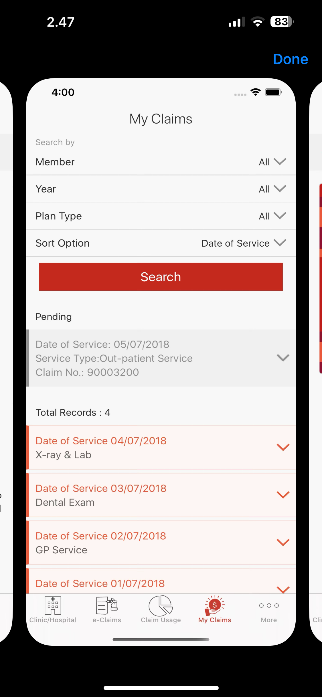
Thus, I came up with an idea on creating a simple app for health insurance where it showcases general needs for the claimers like claim status, how to make a claim, and benefits, not much compared to the actual insurance app I’ve researched but at least the main points for the medical insurance is there. Because sometimes there are some insurance companies that also have finance feature inside the app and program!
I referenced and brainstormed on several real insurance companies application, like Generali, AIA, Prudential;
Generali We Care
-medical focused


PRUforce Mobile
-has chart because it has financial feature


-not only medical focused but also have health tracker (AIA Vitality)


Here's what I did.

I experiment on playing with the bots animation as well as creating a soft transitions between the onboarding pages. It's a lot of fun! One of the example:
I asked on an ex insurance worker as well to crosscheck all the features and it’s a yes! I tried to experiment on doing an app unfamiliar and seems tricky for me, an insurance app. So here's my main screen:


You can find the prototype link on the submission section, after this.
2. Mockups

fig. 4.2, Mockup Compilation Poster
fig. 4.3, Mockups PDF
3. Application

fig. 4.4, Application Promo (Scan-able QR that leads to figma link)


fig. 4.5, Application - Main Screen
fig. 4.6, Application - Walkthrough
Prototype link click here.
4. Artwork Compilation
fig. 4.7, Compilation - Google Slides
If cannot be accessed, click here to access.
REFLECTION
I learned that learning new things may be daunting at first, however if we learnt it step by step and brave enough to experiment, we can found greater things and explore new skills. I learned that there's nothing wrong with trying even if it's fail or it's imperfect. I feel like I learnt several new things in this project, like I had the experience on learning javascript which I feel unfamiliar at first, but with learning I know what javascript looks like and how it works, as well as the animation in Figma, which enhance my UI skillset for creating websites/ application which is applicable in the future. I feel like even I learnt something that unrelated to my specialization, I still will gain something that can be implemented on my career progress. So, it's nothing to lose.


Comments
Post a Comment